Image Caption: FRIES principles of consentful tech, from consentfultech.io
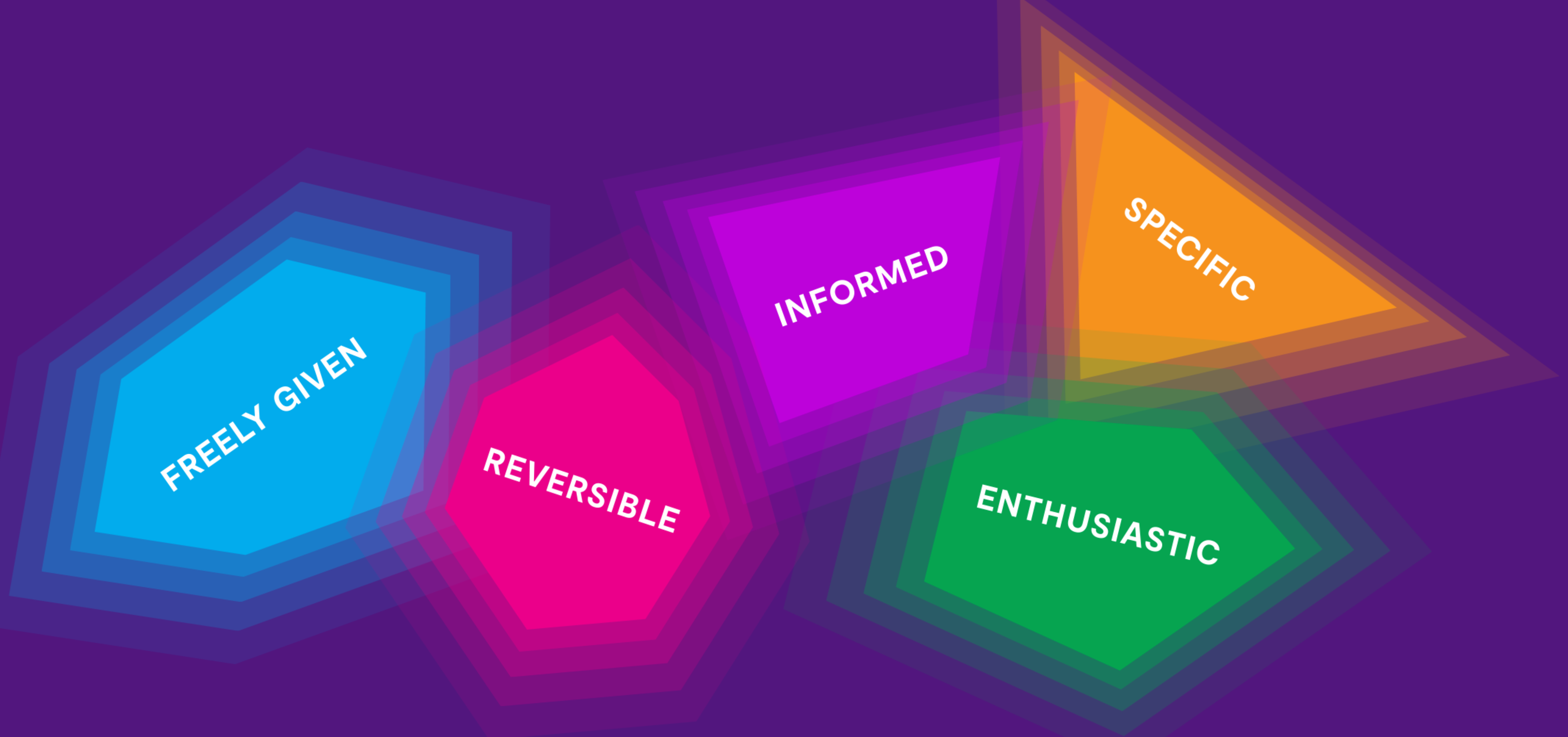
We spend a lot of time talking about accessibility on our team, and we like to talk about things that go “beyond the web accessibility checklist”. These things can include making sites that are easier for the most stressed-out users in an audience group to use, for example.
Adjacent to this expanded notion of web accessibility are privacy and consent. When you think about how to build sites that are as respectful as possible of their users, then it’s easy to see that UX that tricks or manipulates users can be another barrier to access. Worse, intrusive or coercive UX can drive people away from sites they might otherwise want to use, leaving them with a very bad impression of an organization.
Clayton introduced me to the Consentful Tech Project, which provides a framework for applying Planned Parenthood’s FRIES definition of consent to applications. Clayton and I played around with extending that framework into the world of web UX, and the result of those thought experiments is our talk, Consentful UX, which we gave in November for Design4Drupal, as well as Greenpeace Tech Camp.
Below, find the video of our talk from Greenpeace Tech Camp on November 17th, 2020. Here’s a link to our Consentful UX slides (PDF), as well. As boring as this topic may sound to some of you, I can promise that there’s an airhorn in the middle of our presentation, so, hope you enjoy it.
Video Transcript
Johanna Introduction 0:06
Thank you, Nikos, so much. We really appreciate the chance to be here today. Welcome to Consentful UX. I’m Johanna Bates. I am co-founder of DevCollaborative and we are a team that builds websites for nonprofits in Drupal and WordPress, with a focus on accessibility and sustainability of content, design and code. And I’ve been a front end developer for 22 years. I’m particularly interested in accessibility. And that is how I came to this topic. I came to it from an accessibility lens. It really informed my interest in this, I’m somebody who has a lifelong diagnosis of an anxiety disorder and because of that, I’m someone who can get very overwhelmed when there’s a lot of intrusive, or unclear UX on a website, or an app. I feel overwhelmed. I may literally never go back to a site or use an app again, if I get too flooded with intrusive or confusing or obfuscated things. And that’s why I’m here.
Clayton Introduction 1:34
Hi I’m Clayton Dewey, I’m the product owner at DevCollaborative, I’ve been in this field for about half the time of Johanna, 11 instead of 22. I focus on user experience design and information architecture. I was drawn to this topic, both because of my focus on usability and designing tools that empower people and also because of my identity as a parent, as a queer person, and as a polyamorous person. Consent is on my mind and in my practice in my day to day life in a lot of different ways- in how I show up in my community and in my family. And, you know, even more so right now with the pandemic and navigating how we create safe spaces with each other and respecting each other’s boundaries and keeping each other safe. The topic of consent is more important than ever before. Also, as we spend more and more time in digital spaces, how can we take lessons around consent in the face-to-face world and translate that into the digital world? This is something that I’m particularly interested in.
Design Personas - If Our Website Were a Person, How Would You Describe Them?
When we think about user experience design, a good place to start is with a design persona. Design personas are something that were popularized by MailChimp, and Aaron Walter, a former designer there. This is an example of a design persona pulled directly from MailChimp.
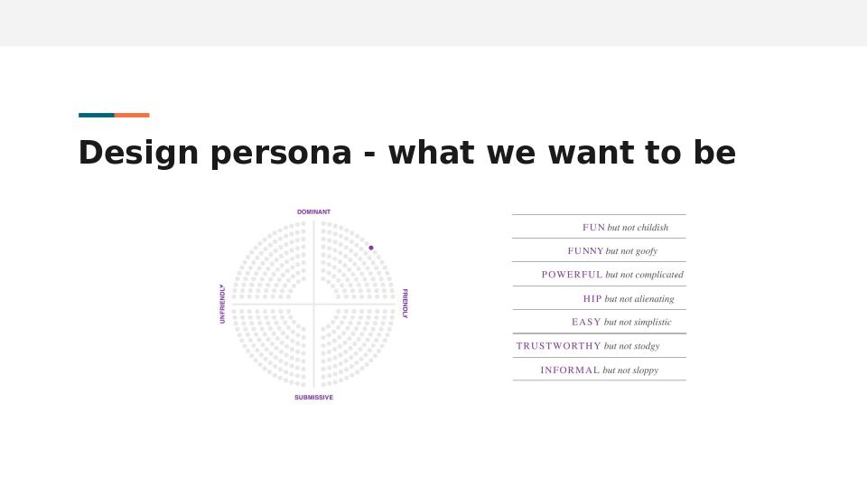
They put themselves here in this quadrant of friendly and dominant, far away from the unfriendly side of the spectrum. They’re using a “This, Not That” framing to describe their application, MailChimp, what it would be like if it were a person. They would be fun, but not childish, funny, but not goofy, powerful, but not complicated.
If we take this design persona activity and apply it to our own websites and apps that we design and build, we come up with something pretty similar, right? Most of us would put ourselves in that same friendly, friendly and dominant quadrant. Unfortunately, oftentimes, the web is not that friendly.
Case in point, just doing the research for this webinar, I was curious about notifications as a dark pattern. So I searched via DuckDuckGo and the first result looked really promising, “Are notifications, a dark pattern?”. Perfect.
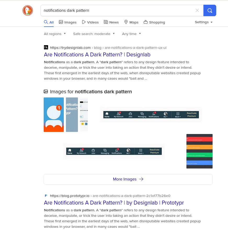
So I clicked on that link, and was excited to start learning.
Instead of the article I was greeted with a “Welcome to the design lab blog, what kind of content are you interested in?” modal.
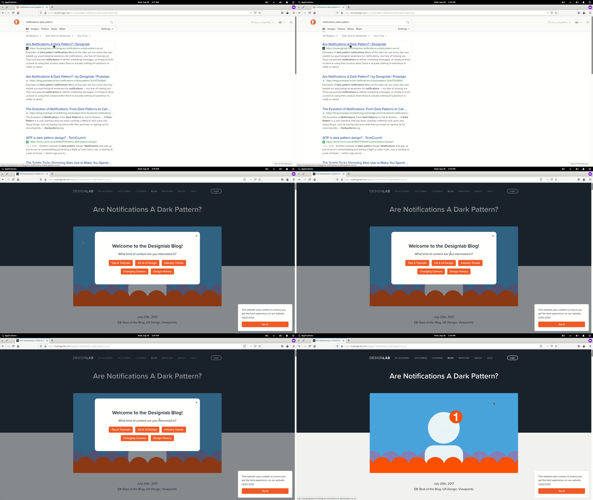
Well, I’m interested in the article that I’m trying to read. Okay, so I’m going to close this out.
Now it’s time to read the article. But wait! what’s in this lower right hand corner?
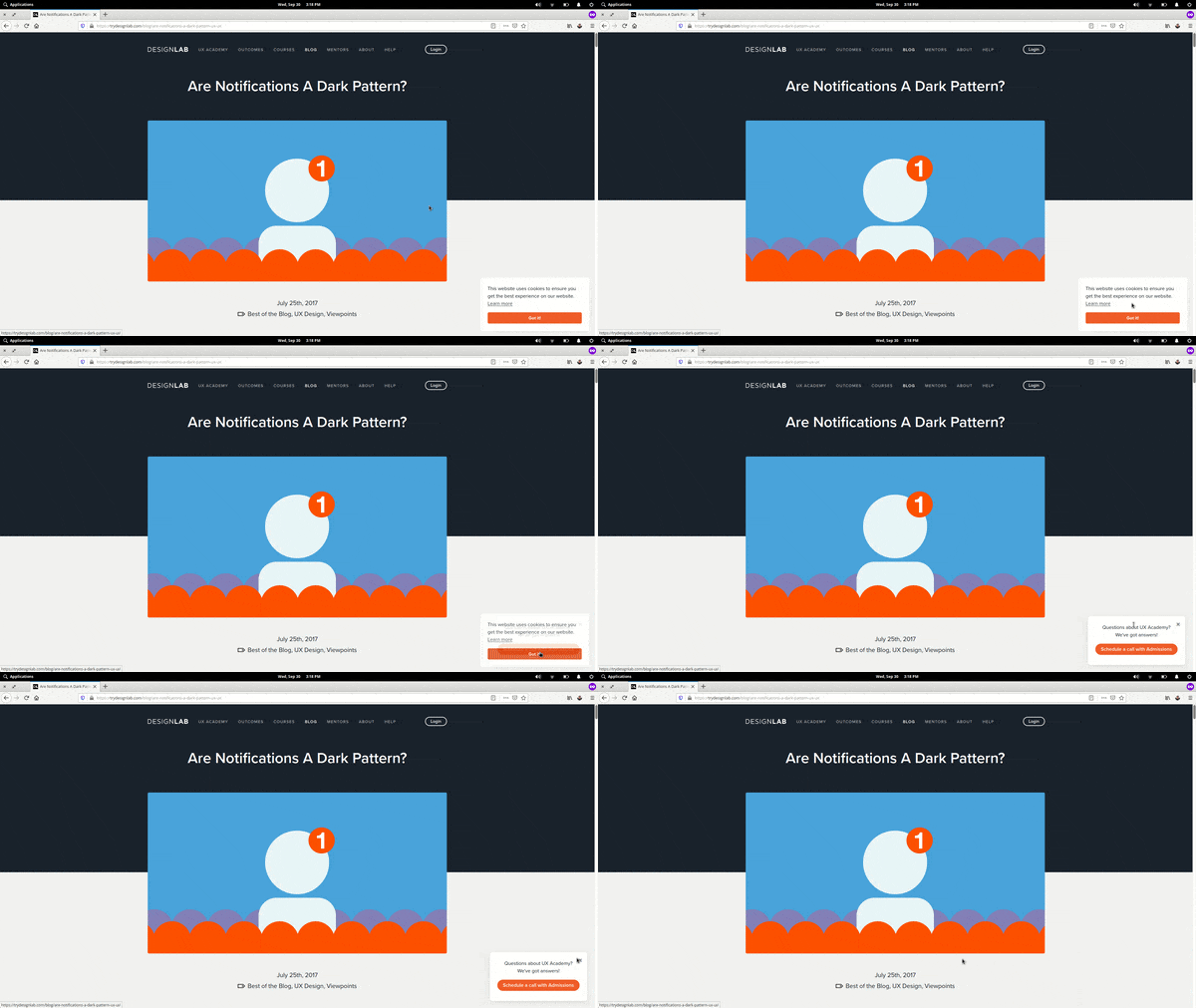
After the first modal is closed, two more appear which further frustrates the user.
They want me to share cookies. Well, I guess I don’t really have a choice. I’m going to click this “got it” button reluctantly.
Okay. Now it’s time to read this article. Wait, what?!? “Questions about UX Academy? We’ve got answers.” No, I have no questions about the UX Academy. I just want to read the article.
Okay. Here we go; on to read the article. Have you ever had a nightmare where you were literally drowning in little red notification badges? Not not personally but I love the hook and I’m reading it and now I’m enjoying it. This is actually a really informative article.
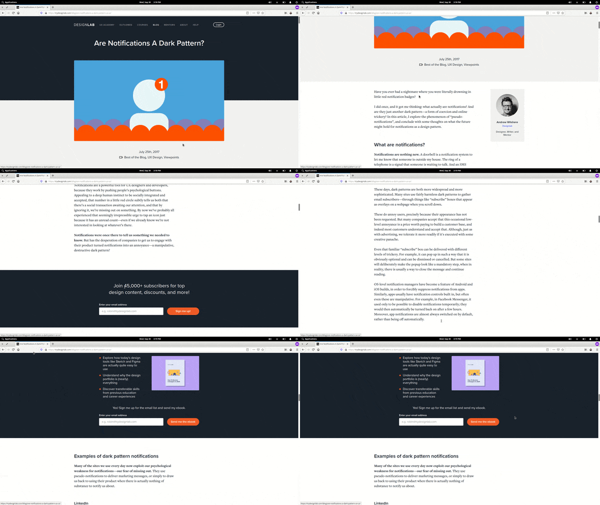
Wait what?!?
“Join 45,000 subscribers us another newsletter call-out.”
Okay, back to the article. Okay, informing myself. Wait, what’s this?!? “Get Your FREE eBook?” No, I don’t want this. I move my cursor to leave the site. And instead the screen is taken over by another prompt for me to try and download this ebook. So frustrating.
It really reminds me of that scene in the movie airplane where the pilot is trying to get to his flight.
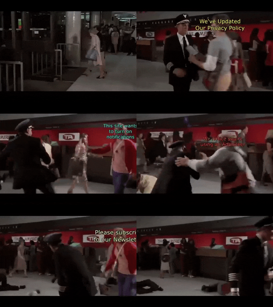
He’s walking through the terminal…
This site uses cookies.
We’ve updated our Privacy Policy.
Review your settings.
The site wants to turn on notifications.
We noticed you use an ad blocker. Sponsored content. We want to know your location.
Clickbait. Amazon ads. Subscribe to our newsletter modals.
They’re everywhere!
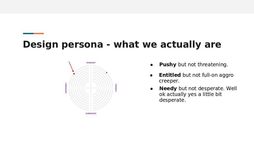
We’re constantly being bombarded by these different calls to action, other than what we came to the site for. It’s exhausting. So if we return back to that design persona that we’re aspiring to, are we really friendly and dominant? I feel like it’s more in the unfriendly and dominant quadrants. Are we being fun, but not childish? or hip, not alienating? I would describe it more like pushy, but not threatening. Maybe entitled, but not full on aggro creeper. And needy, but not desperate. Well, actually, when I moved that cursor to leave the site, and they tried to push that ebook on me again, that was actually quite desperate.
So with that, I’ll let Johanna put a name to what we’ve just experienced.
Johanna - Coercive UX: Pop-ups, Modals and Notifications 7:19
Yeah, so for the sake of exploring Consentful UX, we’re gonna call some of these very normal patterns that we’ve all become very used to, to the point where we may not even notice them consciously anymore, coercive UX. They are UX patterns that manipulate users to try to get them to do something that we want them to do.
We see them every day. They include, not only modals and pop ups, but also dense Terms of Service, tricky copy on buttons, all kinds of cookie notifications that aren’t really doing their job. These seem very normal to us, but when you look more closely, they’re actually manipulative.
I want to zoom for a couple minutes on specifically pop ups, modals and notifications because they are ubiquitous right now. They are more than just annoying. I knew this just from being a user on the internet, but I wanted to dig deeper and understand why they’re so ubiquitous right now, and how they degrade user experience.
Before I go there, I do want to say that there are some good reasons to use these patterns. The alert dialog is an old concept in software design. And this kind of pattern interrupts the users flow. It forces them to stop what they’re doing. If it’s a true modal, where the background window is inactive, they force a user to acknowledge the message, or take some action before they can go on with whatever they were doing. When this pattern is helping users by grabbing their attention to let them know that something very serious might happen if they proceed, then that’s a great use for them. However, when they interrupt the user, often repeatedly, to try to get them to take an action they didn’t come to a site to do, it’s not helpful at all. It’s coercive.
As we showed earlier, even researching this topic, we encountered plenty of coercive UX. For example, I wanted to read about whether or not these patterns work for marketing purposes. So here’s an article I found about how to use popups to increase conversions, and I was just getting to the exciting part, where they tell you how to avoid getting penalized by Google in SEO rankings for using modals, pop ups and interstitials on a mobile site. I’ll talk more about that later. After about 30 seconds, when my brain was good and focused, this pop up opened, covering my content. I’ve got two options here, I can put in my email address, which I love to share, and they can “send me everything.” Wow, that’s just really appealing, let me tell you, or I can close this pop up with a really difficult to see low contrast X in the upper left corner.
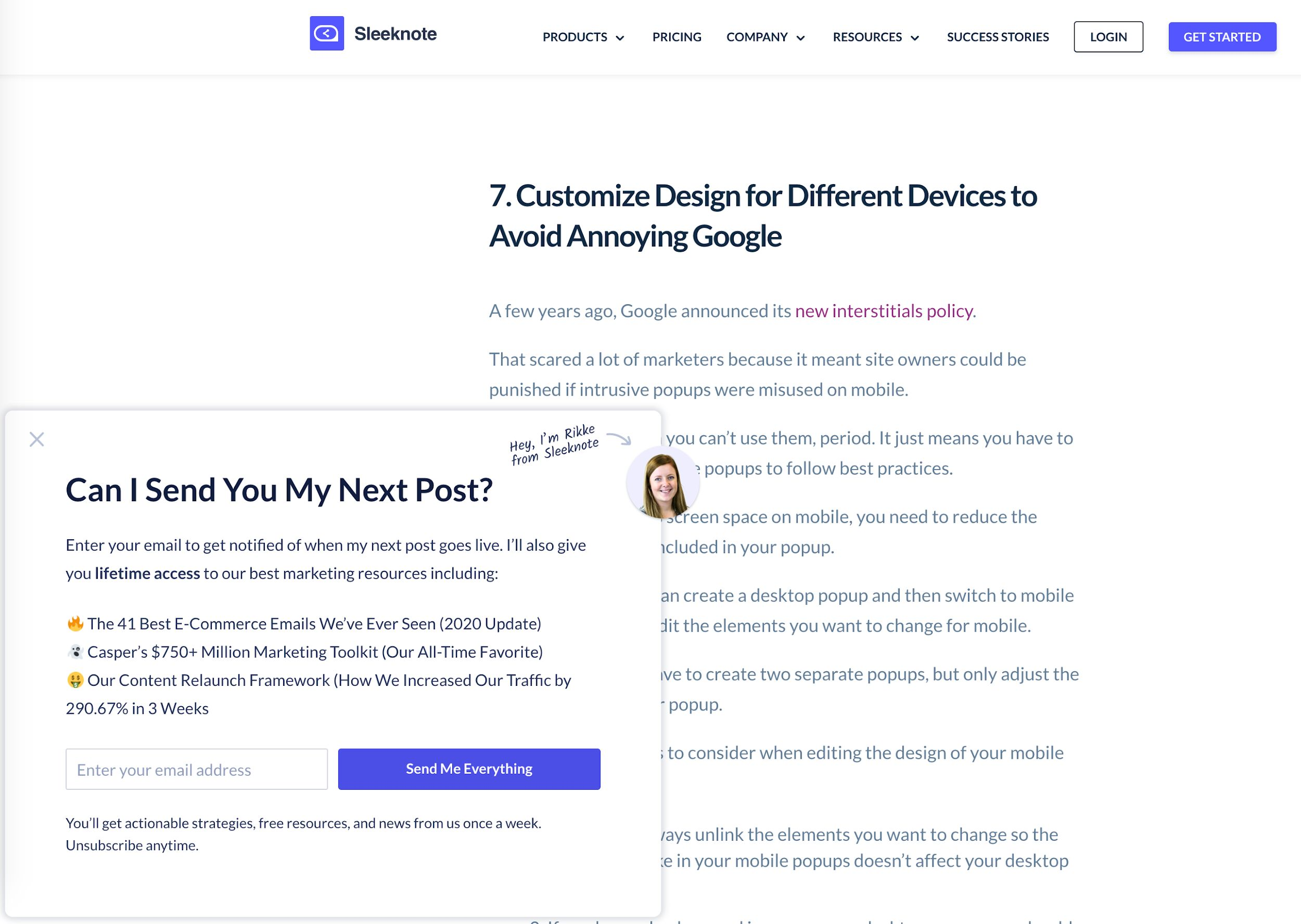
When this happens over and over and over again, on the same article or successive articles when you’re trying to research something or purchase something or use a service, it’s exhausting. I have a limited amount of time to read and to focus every day. Getting derailed from my tasks leaves me feeling anxious and stressed. If it’s too excessive, I won’t ever go back to the site again; it will leave me with a very bad opinion of the company, or organization. But clearly some people are signing up for this newsletter to send them everything. I don’t know who those people are, but somebody’s signing up. Otherwise, why would these patterns be everywhere?
So what does research show about this? Well, Nielsen Norman Group research shows that I’m not alone. Many users hate these patterns. They’re among the most hated patterns on the internet. But we use them often, because marketing says they work and that they increase conversions. But do they increase conversions?
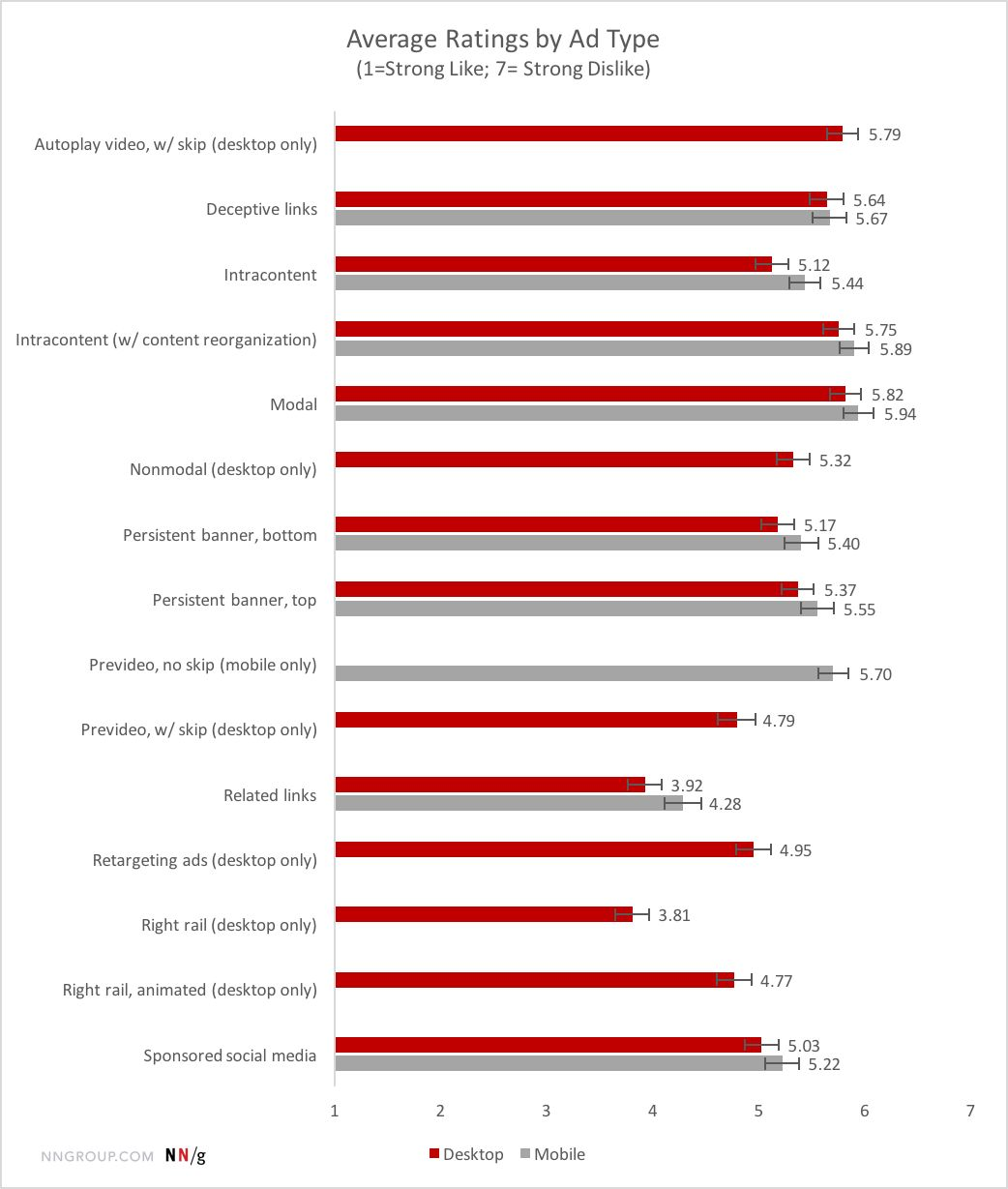
A Note on Vanity Metrics
In researching, I found many articles about how these intrusive patterns do sometimes appear to work. They often produce bumps in particular kinds of metrics that I’m going to circle back to later in the presentation, that are sometimes called vanity metrics. There will often be an increase in your email list size, more petition signatures, higher open rates or an increase in website traffic to a particular thing that you’re promoting. There’s absolutely nothing wrong with these metrics. They can be really useful. But they’re a little bit more like Robo spam calls. They’re using a wide end of a funnel trying to capture as many users as possible, in the hopes that some of the conversions that they do get will be meaningful.
It’s important that if you’re measuring those things, you’re also asking other questions.
- How many users did you annoy and lose?
- How many people entered fake email addresses, and how many sales or donations or meaningful actions did this UX pattern actually result in?
And asking those questions over a longer span of time.
I’m going to give you some resources at the end of this presentation for how to craft these kinds of deeper questions in your organization. Back to my point, forcing the redirection of a user’s attention is a form of coercion. Hijacking visual or mental focus, as with a modal, forces someone’s attention away from their intended focus, and may degrade their ability to engage fully with your content, service or program. It wears users down, so they may share their information just to stop being harassed. Again, this is a form of coercion.
Motion as Coercion
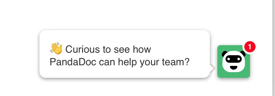
Another tool that designers use for this is motion. That’s why we see an increasing number of chat bots that pop up in the corner. They will oftentimes have a red notification badge and for people who can see the motion and for people who can see the color red, designers and cognitive scientists know that people are wired biologically to respond to motion and the color red if they can see it, even if it’s in the periphery of our vision. That’s why we’re getting an increase in this pattern. When we’re doing that, we’re actually exploiting a biological process of attention in order to redirect a user to do something that we want them to do. Attention is a limited resource, especially right now.
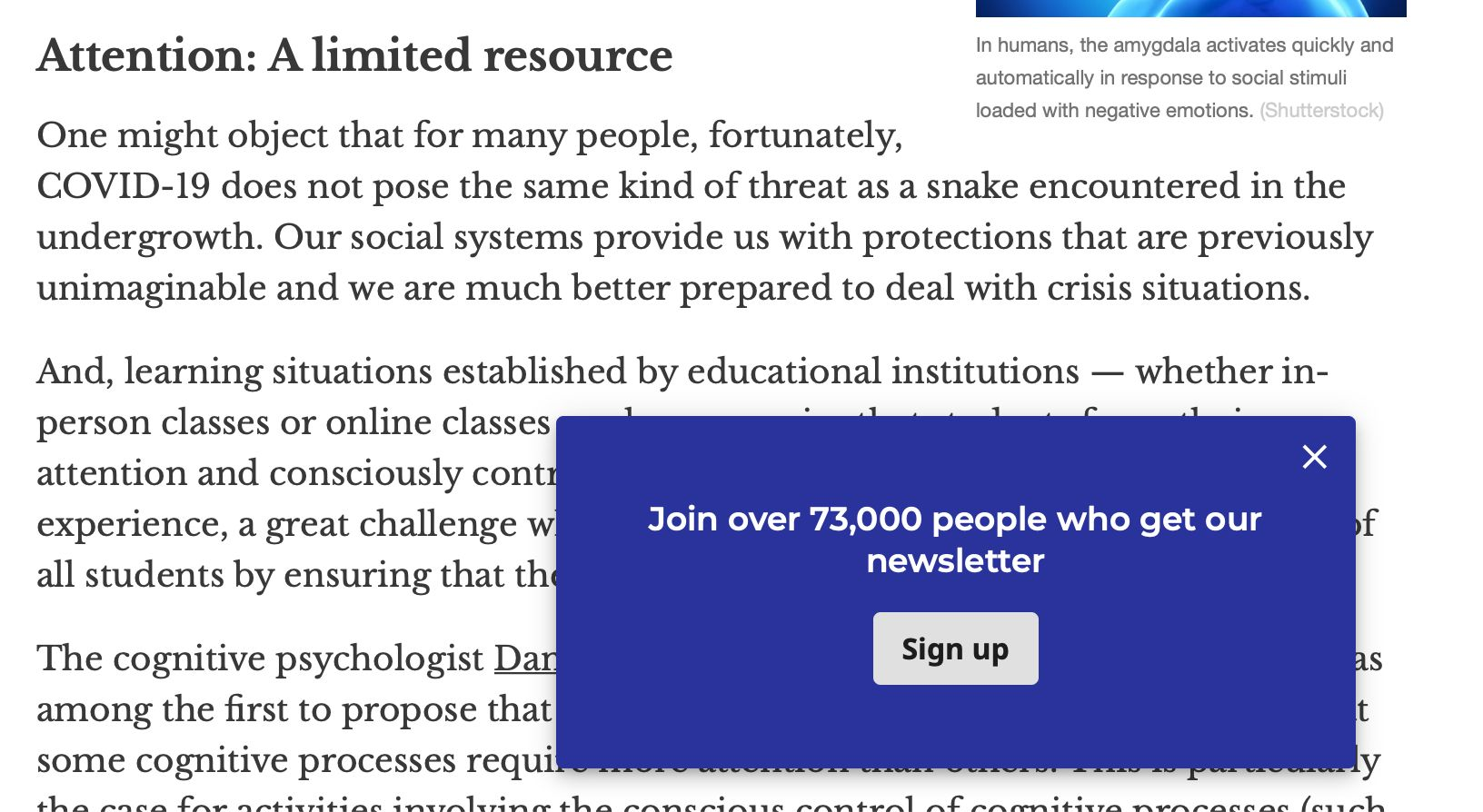
So I got this pop up when I was about a minute into reading this article about cognitive overload in the pandemic. The delayed, timed modal is particularly one that really makes me frustrated because I have managed to focus on this article. I’m, four or five paragraphs in to this article and this pop up is like, “Hey, don’t you want to sign up for our newsletter?” Just like a computer, human brains have a limited amount of processing power. When the amount of information coming in exceeds our ability to handle it, we may take longer to understand information, we may miss important details. I may take longer to understand information. I may get overwhelmed and abandon a task entirely, which hopefully will not happen during this presentation.
People come to your website, or your app with different levels of cognitive load already that they’re carrying around. We don’t know what users are experiencing when they come to our websites. Maybe they’re checking their phone in the bright sun or trying to check their phone, in the rain at a bus stop. Maybe they’re in the waiting room of a doctor’s office and they’re really stressed out and they’re trying to read something while they’re distracting themselves from something. Maybe they’re trying to work while watching a baby, which is a global problem right now, and it’s not easy.
When we erode their ability to focus on what they need to focus on, it can easily cause cognitive overload. They may just give up and leave your site. In terms of accessibility, cognitive overload, specifically affects users with mental health challenges, attention deficit and other cognitive issues. People who don’t speak the language as their primary language that which your site is written in, people who are less comfortable with technology, people with a lot of anxiety and stress. I don’t know many people who aren’t experiencing extra anxiety and stress right now.
We’re just not respecting users, when we use these patterns in excess. It shows users that we don’t trust them to engage with us in meaningful ways. If they do like us, and that’s just not a healthy relationship. Coercive UX patterns manipulate users to try to get them to do something that we want them to do. A great question to ask yourself, is, would you do this with someone in person? The Nielsen Norman group has conducted decades of user research, and they know that people find intrusive patterns frustrating. In a usability study, they observed a user attempting to complete a task. After encountering multiple pop ups, he angrily tossed his phone across a table. Frustrated, he abandoned his task and left the website never to return, with a very bad impression of the organization.
Clayton 19:11
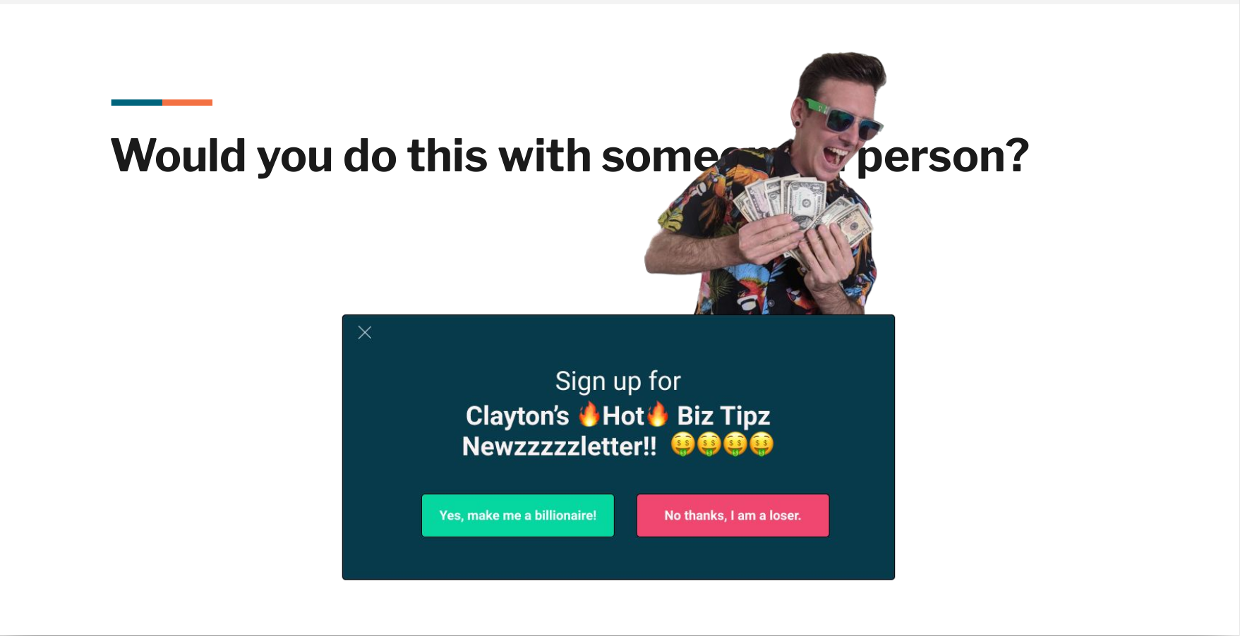
[LOUD AIR HORN NOISE] Wow Johanna did you say bad impression? That sounds bad for business, but you know what’s good for business? My new newsletter, Clayton’s Hot Biz Tips! Are you gonna sign up and be cool like me, are you just a loser?
Johanna 19:28
I’m a loser, Clayton.
Clayton 19:30
Oh, come on. Alright, fine. Well, next time you and I hang out I’m asking you if you want to sign up for that newsletter. It’s great. I won’t take no for an answer.
Johanna 19:40
Okay, so you probably get our point. We just acted out a user having a conversation. I’m convinced that we can do better than this. I’m going to hand this back off to Clayton, who’s not going to give you biz tips except really good biz tips about how to use a framework that will make UX more respectful and more consentful.
Clayton Defining Consent using the FRIES Framework 20:08
I hope all of you have recovered from that interruption. So what is consentful UX?
Consentful UX comes from the concept of consentful tech, which came out of the Consentful Tech Project.
They have this definition for us,
Consentful technologies are digital applications and spaces that are built with consent at their core, and that support the self determination of people who use and are affected by these technologies.
This was designed and developed by designers and activists and movement organizers who work at the intersection of technology and justice. I love this definition.
So if consent is at the core of consentful tech, what does that mean? Well, they build off the definition of consent put forth by Planned Parenthood. Planned Parenthood came up with the FRIES framework, which is
- Freely given
- Reversible
- Informed
- Enthusiastic
- Specific.
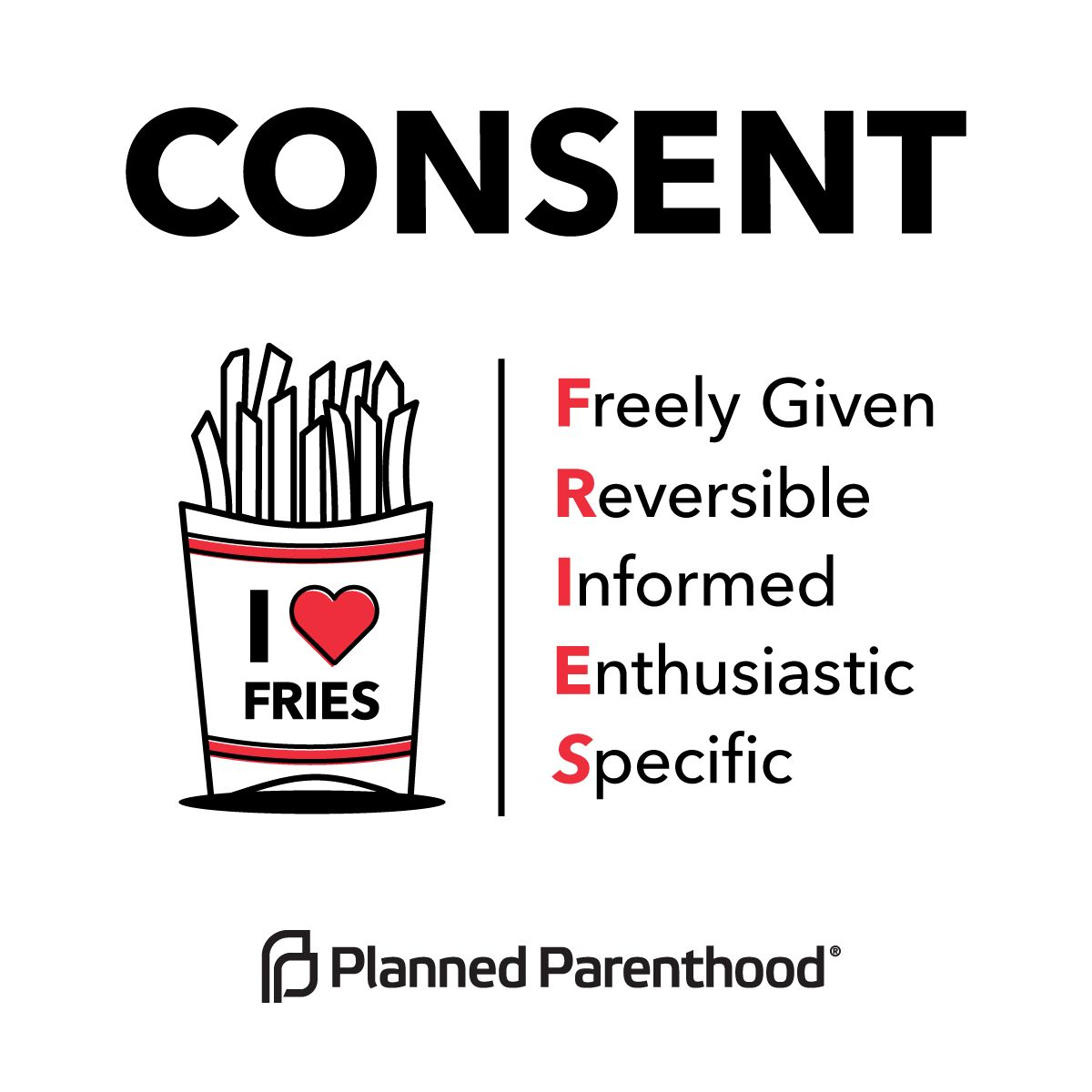
The Consentful Tech Project mapped each of these principles to digital spaces. Let’s take a look at these.
Freely Given
The first is freely given.
If an interface is designed to mislead people into doing something they normally wouldn’t do, the application is not consentful.
Coercive
- Pop-ups, modals, interstitial videos
- “Manipulinks” & coercive copy
- Autoplaying video or audio
Let’s take a look at a few of these examples in the wild.
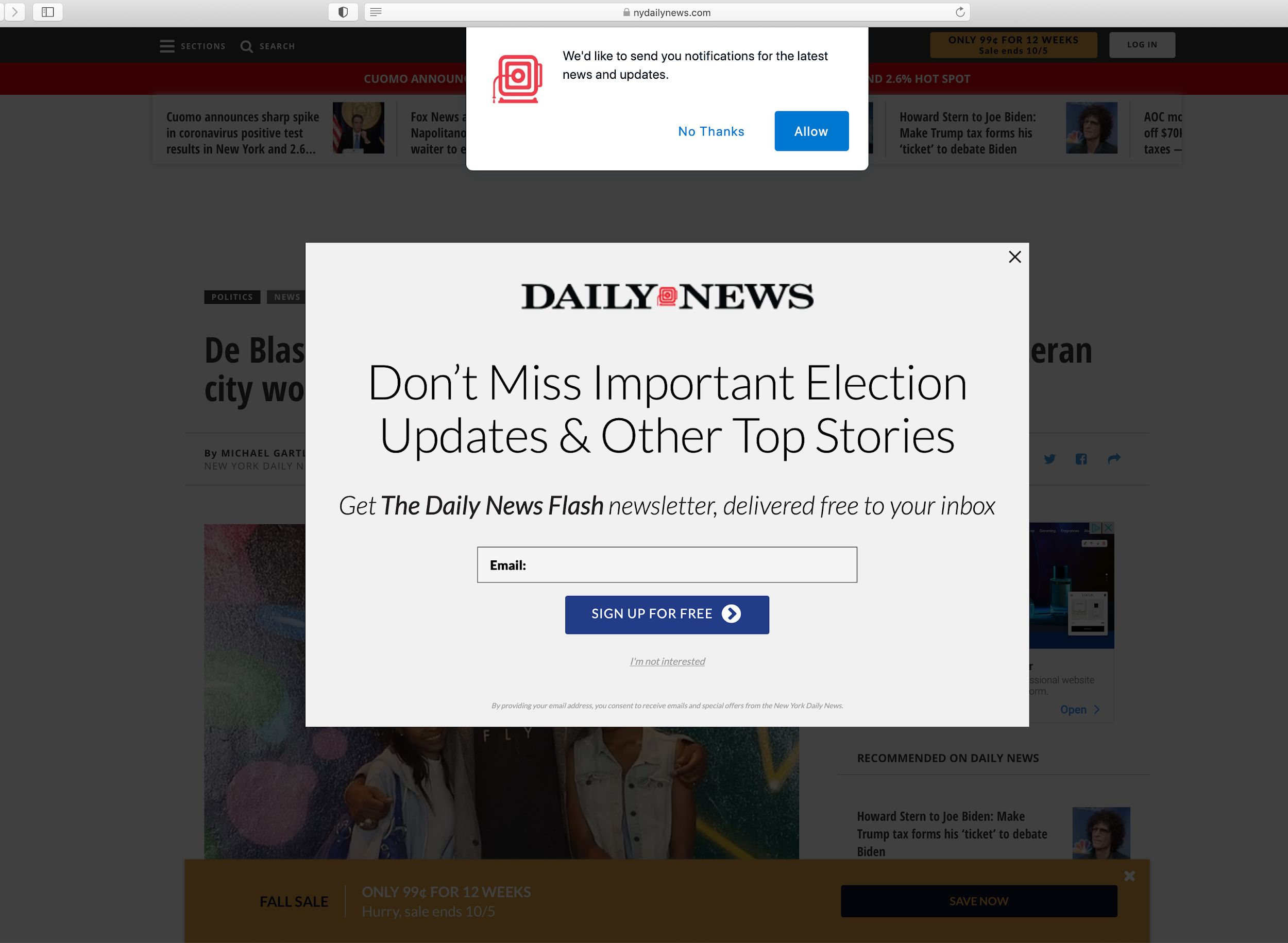
A really common coercive UX pattern is on is found on a lot of news sites. So here I am, I’ve come to this new site. There’s some important information about COVID-19 in my community that I’m trying to access. And instead, I’m greeted with a newsletter pop up, and the site asking if I want to sign up for notifications, notifications.
No, I don’t want either of these things.
Instead of doing this, I really love what Bitch Media is doing. This is an article that they published. It’s a collection of book reviews. And so here I am, I’m reading this book review about the book making friends with Alice Dyson, I read the review, and I come to the end, and I naturally, I come to a natural end of my reading, and I see this call out to sign up for their newsletter.
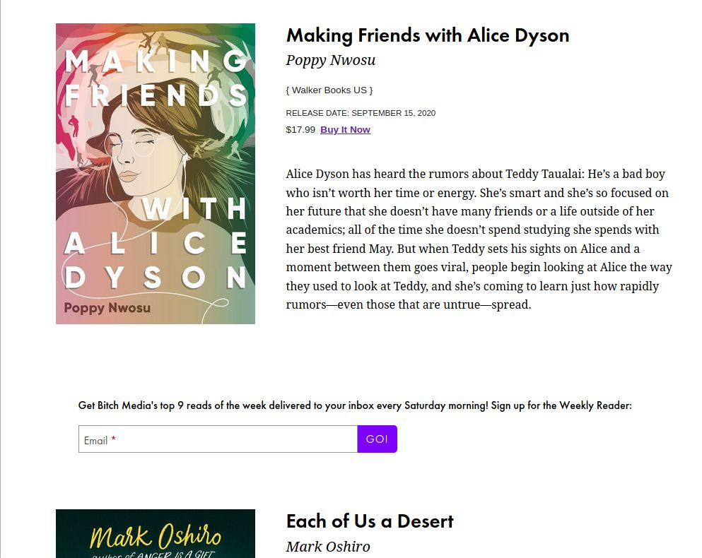
What I love about this is that it’s not suddenly appearing while I’m in the middle of reading something like Johanna was talking about earlier. Instead, it’s coming in at a natural time and is not interrupting my attention. It’s still prominent enough that now I know about this newsletter, and I can choose whether or not to engage with it.
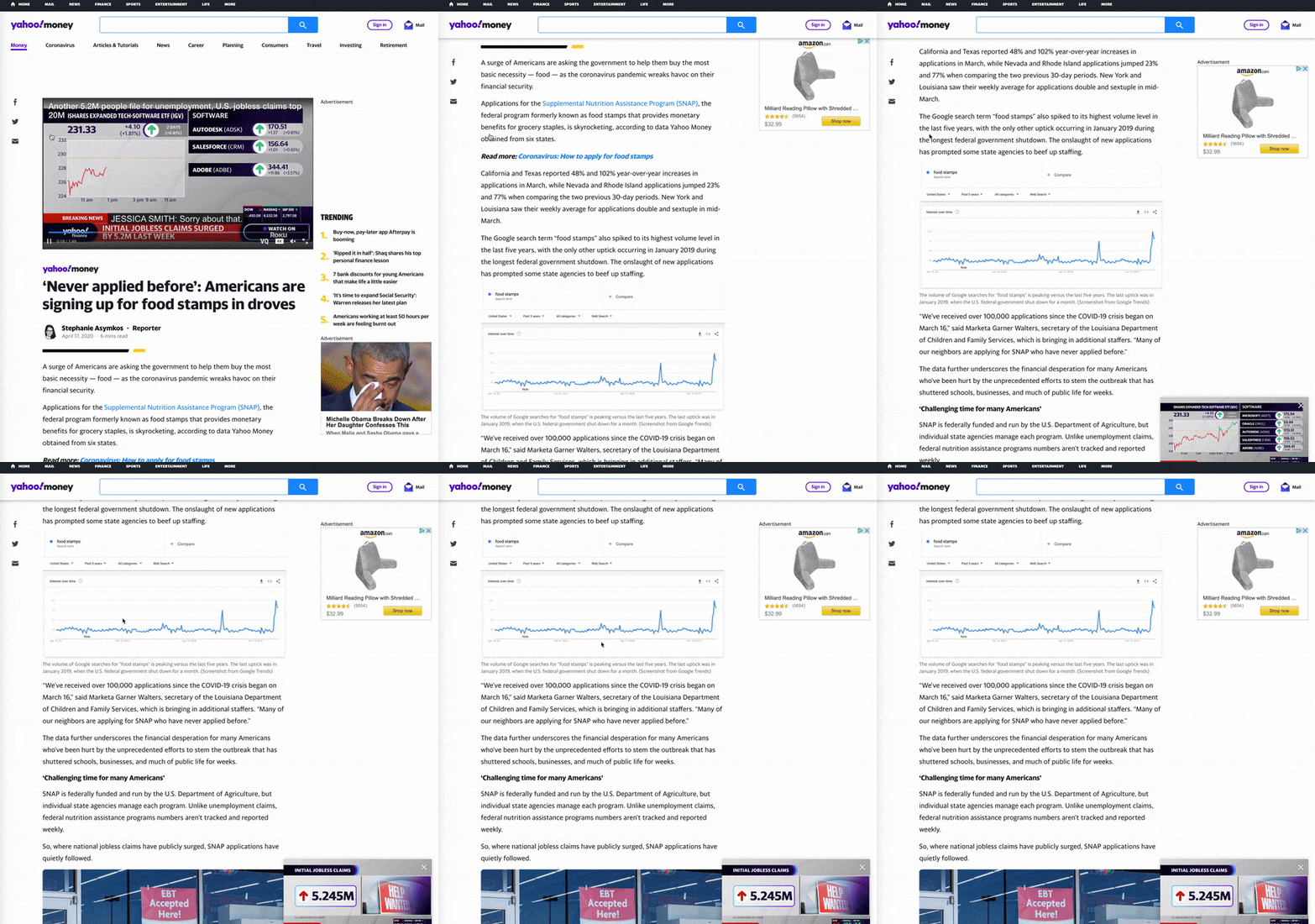
Another example, of coercive UX. Here again, is me coming to an article, there’s a video at the top and I’m not interested in the video. So I scroll down to read the article. But the video then follows me down the page. And on top of that I have the social share icons that are also following me down the page on the left hand side, and then an Amazon ad off to the right. The content I came here for is squished in the middle and it’s very difficult for me to to read what it is I came here for.
So another example, here’s some coercive copy on Etsy, almost gone, there’s only three left or on Airbnb 78% of places in New York for your dates and guests already booked. You may want to book soon. You know if this was happening in real life, this would be that pushy salesperson that we hate so much.
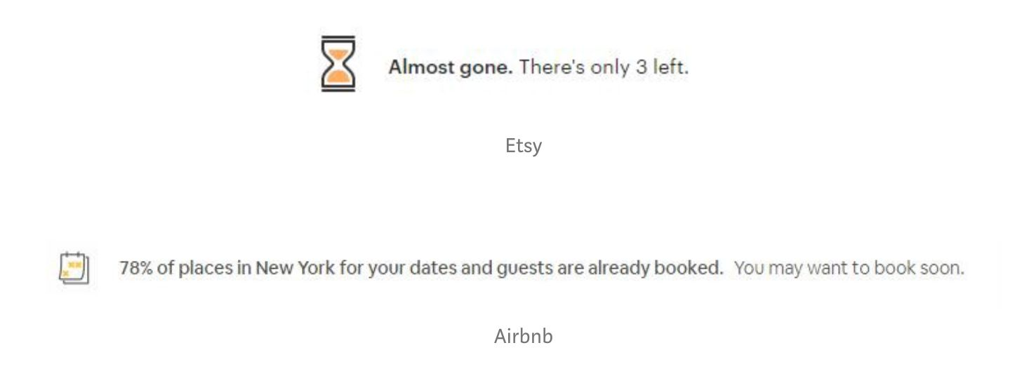
In summary, if you have an important call to action you want users to know about put it in the flow of content, include it in the header or footer those are persistent areas that people can see, or have your call to action appear at the end of the article after they finished reading.
If you’re going to use video or audio, make light and intentional use of it and have a play button that the user initiates themselves. Always include a pause button so that they’re in full control of motion.
Consentful
- Newsletter sign up in flow of content, header, or footer
- Call to action appearing at the end of an
article - Light use of animation, play button,
pause button
Reversible
On to the next principle, we have reversible.
In technology, you should have the right to limit access or entirely removed your data at any time.
This is an important part of consent, right? If we say yes to something once that is not a blanket, yes, For all future interactions of that, we always have the chance to change our mind about something.
Coercive
- No mention of how to delete data
- Onerous process for deleting data
- Unsubscribe links in teeny tiny font with low contrast
We’re going to see just how easy it is to unsubscribe from amazon prime.
Thank you friendly robot for showing how in just five simple steps you can cancel your Amazon Prime subscription.
Wow, that was ridiculous.
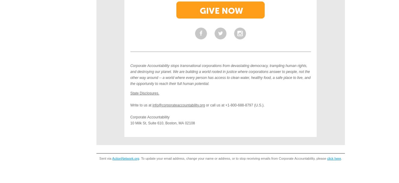
Another example of coercive UX is that unsubscribe link. This one was particularly tricky because I have gotten so used to finding that “unsubscribe” label and quickly unsubscribing, but here Action Network, who I usually love their their work, but in this case, uses a frustrating coercive pattern. I couldn’t find the unsubscribe link for the life of me. I was scanning and scanning until I finally realized that they intentionally didn’t use that unsubscribe label. Instead, it’s “to update your email address, change your name or address or stop receiving emails from Corporate Accountability, please click here.” Those of us in the in the UX world we know how much we hate that click here link to so finally found it.
When I finally click on the “Click Here” link I’m taken to this page where here we get one more act of desperation. The “yes unsubscribe me” button is in red.
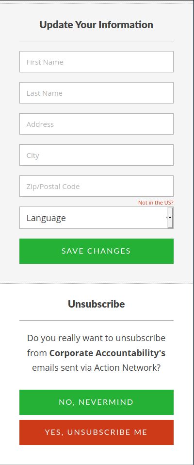
Really?? Really was that necessary?
I came here to unsubscribe. Please, let’s drop the coercive UX patterns already. Just please don’t do that.
Consentful
- Make it easy to find instructions on deleting your data
- Make it easy to unsubscribe from something
Informed
The third principle of FRIES is informed.
Consentful applications use clear and accessible language to inform people about the risks they present and the data they’re storing. Rather than burying these important details in, for example, the fine print of terms and conditions.
Coercive
- Dense, unreadable privacy policies and Terms of Service
- Clauses to change privacy policies at any time without notice to users.
- If you have a multilingual audience, failing to translate or translating poorly, your privacy policies or Terms of Service
I recently was looking into web hosting and found a pretty promising web host. I won’t mention their name uses 100% renewable energy to power their their servers and the privacy policy was riddled with typos to the point where some of it just did not make sense.
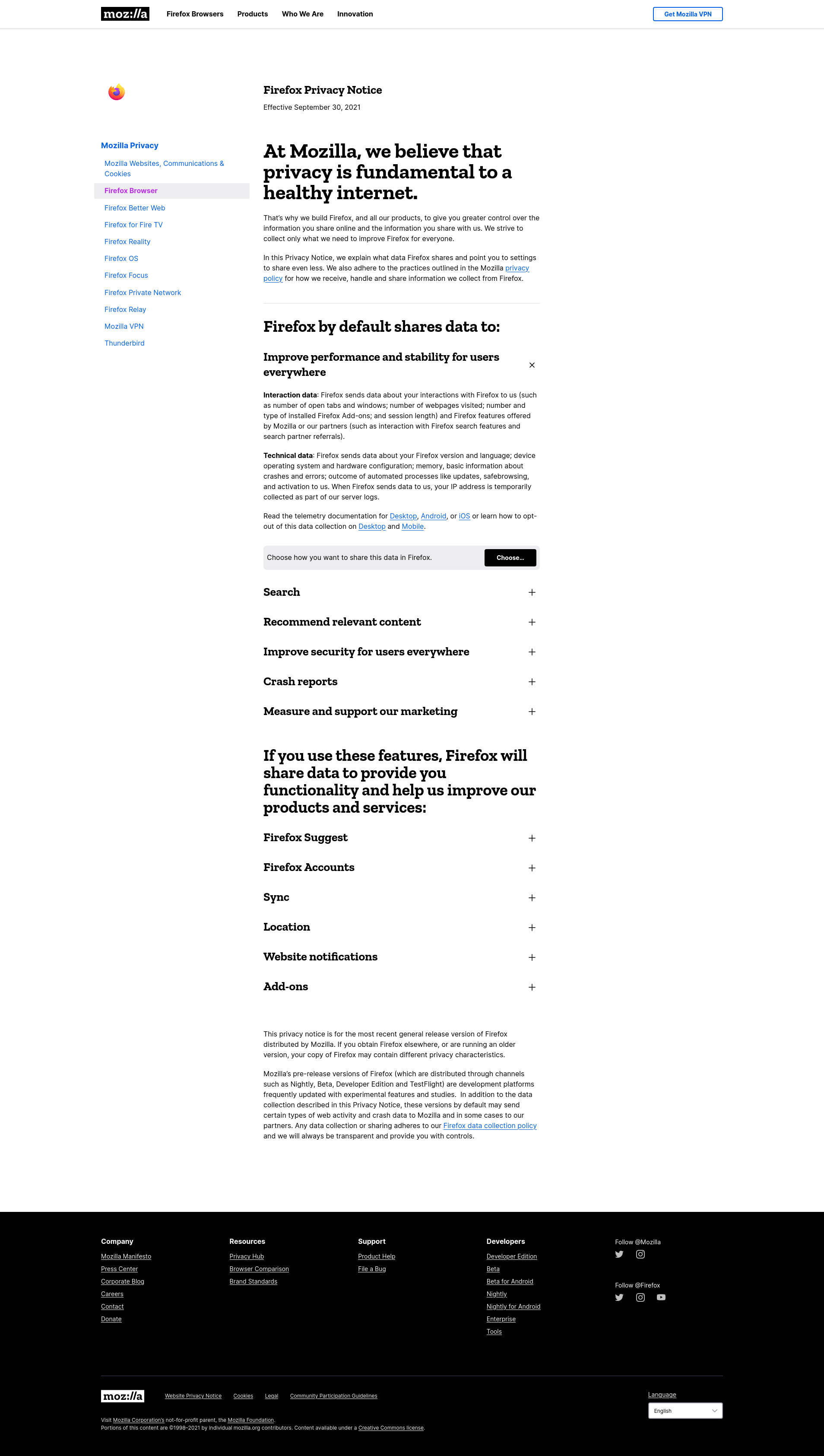
A good example of Consentful UX is Firefox’s privacy policy page.
I love this, because they take what is typically this really dense legalese, and they put it into really plain language. They’re using headings here to break that into the top level reasons why why we are sharing certain data with Firefox. They go a step further, and they have a link to then change those preferences to your liking, which harkens back to that reversible principle of making it easy to delete data that you’re sharing with the service. Absolutely love it.
So to summarize, to say “yes” to something we have to be fully informed on what we’re saying yes to.
Consentful
- Make your privacy policy easy to understand.
- Notify your users when your privacy policy changes.
- Translate important documents into the languages that you your users speak and read.
Enthusiastic
Okay, on to the fourth principle of FRIES. enthusiastic.
If people are giving up their data, because they have to in order to access necessary services, and not because they want to that is not consentful. Right if we’re raising the bar and what we mean by consent, we want to be excited about saying yes to something. So some examples of this.
Coercive
- Performative cookie consent banner (ie: only has an Accept button)
- Aggressive notifications
Let’s look at some examples.
The Performative Cookie Consent Banner
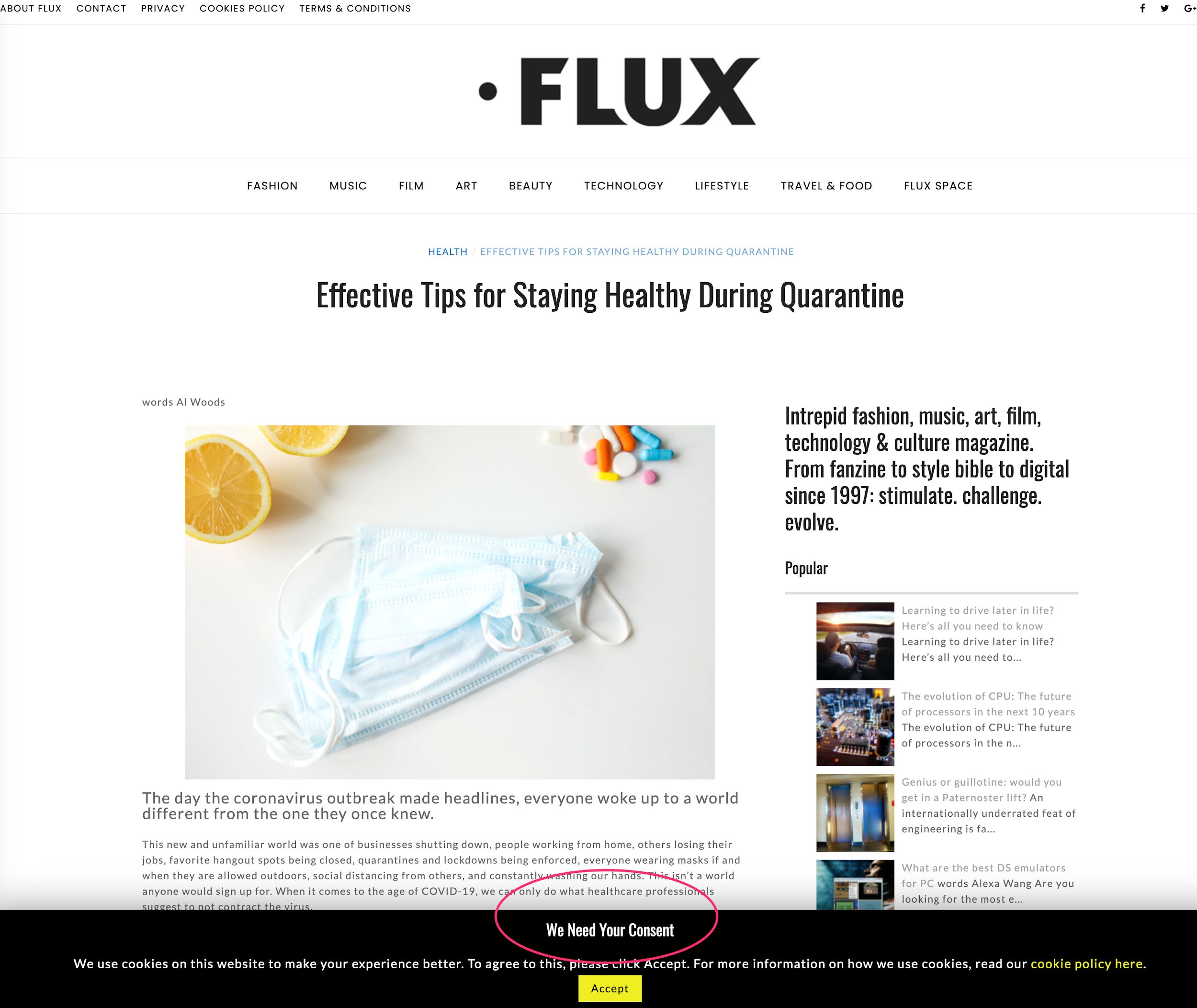
I’ve seen some pretty bad cookie walls in my day, but this one might take the cake, “We need your consent.”
Wow, that just flies in the face of the whole point of consent. All we have is “Accept.” So no, this is this is not consent.
Aggressive Notifications
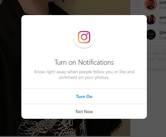
How many of you are on Instagram and have to continue to say “Not now, I do not want to turn on notifications.”? Apple has become particularly bad about this as well. If I’ve said no once respect that “no.” If I ever want to turn on notifications, I’ll go to my profile settings and turn on those notifications.
A much more consentful pattern is what the Allied Media Project’s website did. And I love this. And it makes sense because this is an adjacent project to the Consentful Tech Project that this whole consentful technology concept arose from.
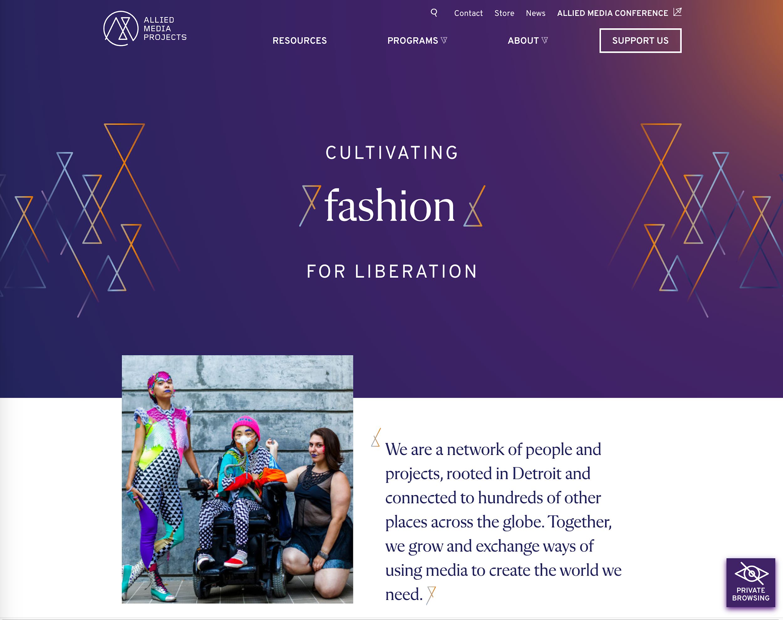
So they have, as you can see, in the lower right hand corner, we have this private browsing icon. I’m curious. So I click on that and learn what that means.
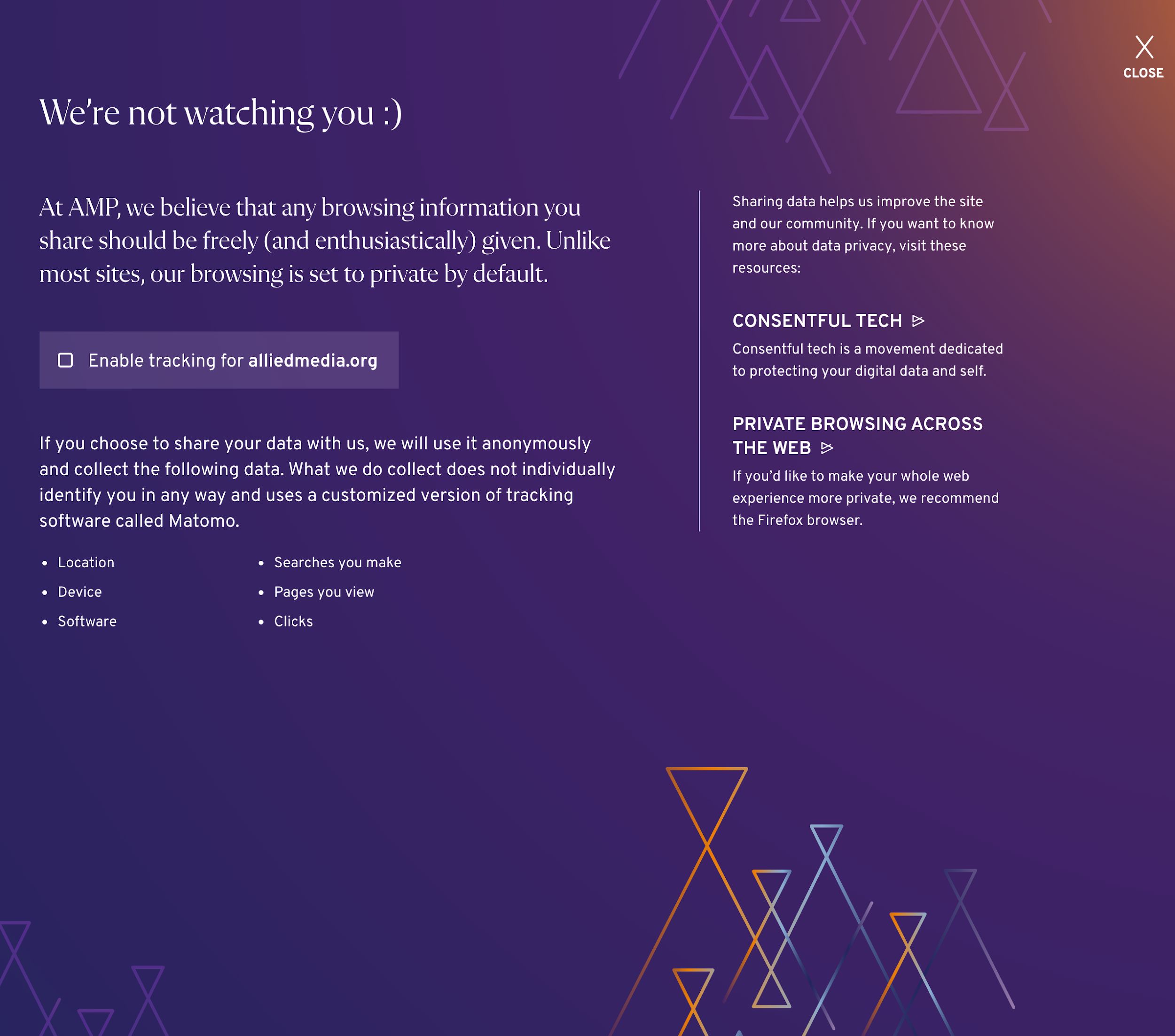
I’m shown a modal here with this friendly message that we’re not watching you smiley face loving it already. It states, “At AMP, we believe that any browsing information you share should be freely and enthusiastically given. Unlike most sites, our browsing is set to private by default.”
So here’s a big brain galaxy brain moment. Start without tracking and then have the users opt into it. I love it.
Then there is a link there that allows me to then say, “Yeah, okay, I’ll share my location with you. I’ll share my device information to give you some helpful analytics.” I trust you now. We’ve built, in a short amount of time, a relationship of trust.
We didn’t even plan this originally when we were finding examples, but they have a link out there to Firefox as the recommended browser. I believe that even links to Firefox’s privacy policy which tells you more information about why Firefox is a privacy respecting browser.
So to recap, rather than those cookie walls and performative cookie consent banners, your site must be functional if you decline advertising in our analytics cookie. This is a semi recent ruling from GDPR. You can cannot force users to accept cookies unless it is core to the functioning of your website or service. And advertising analytics does usually does not qualify as core functionality.
As for those aggressive notifications just don’t do them to respect users notification wishes.
Specific
Now we’re on to the fifth and final principle of FRIES: specific.
A consentful app only uses data the person has directly given not data acquired through other means like scraping or buying, and uses it only in ways someone has consented to.
Coercive
- No cookie or generic cookie notification
- Making gender and other personal info fields required when not necessary
Another one I’ll throw out there now is with the election season in the US just winding down, I was on so many lists that for candidates I had never even heard of. Data sharing without consent is quite intense.
Cookie consent banners should be specific to that cookie. A good example of this is the NHS site.
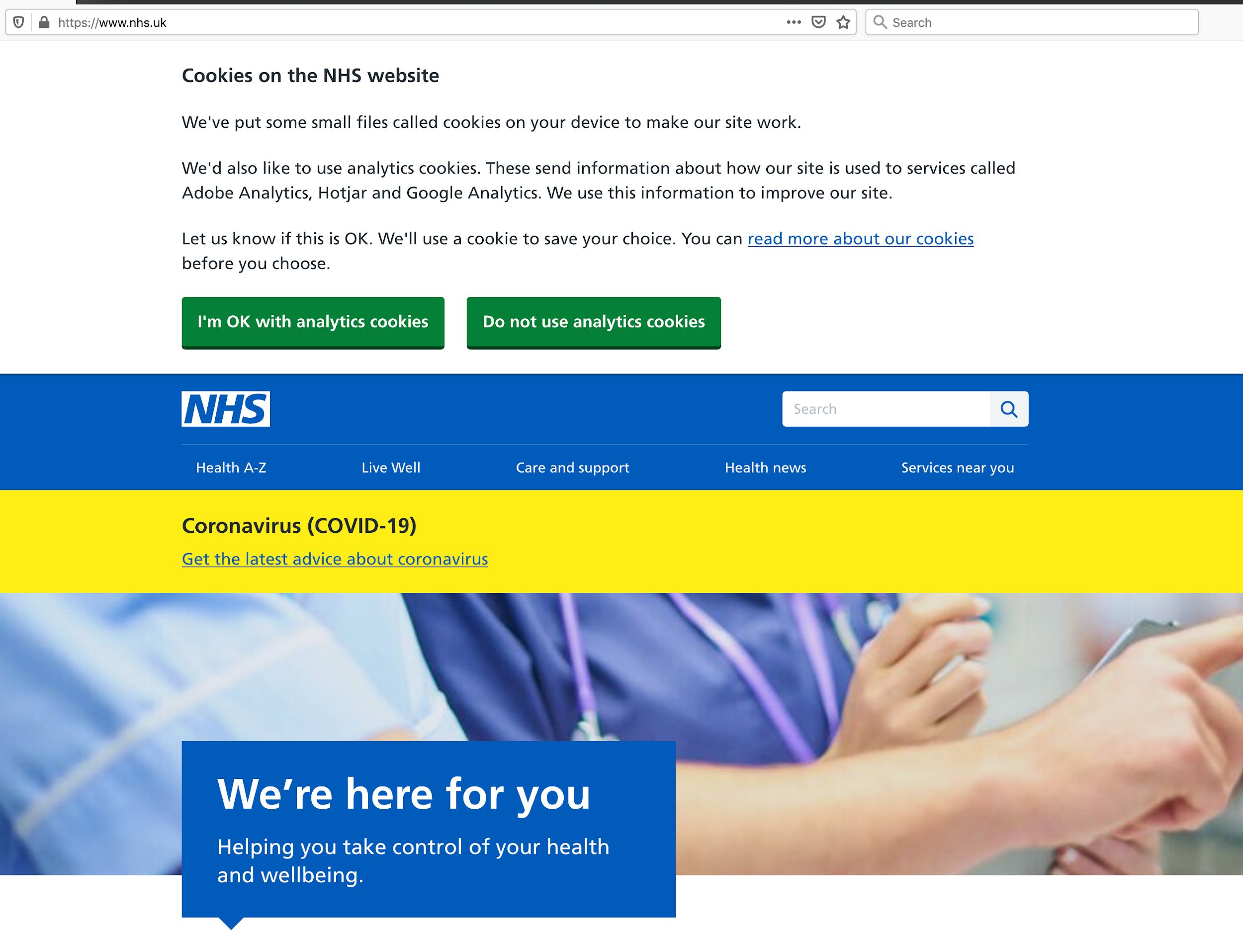
When you click on the read more about our cookies link, you’re taken to a page similar to that Firefox privacy policy page.
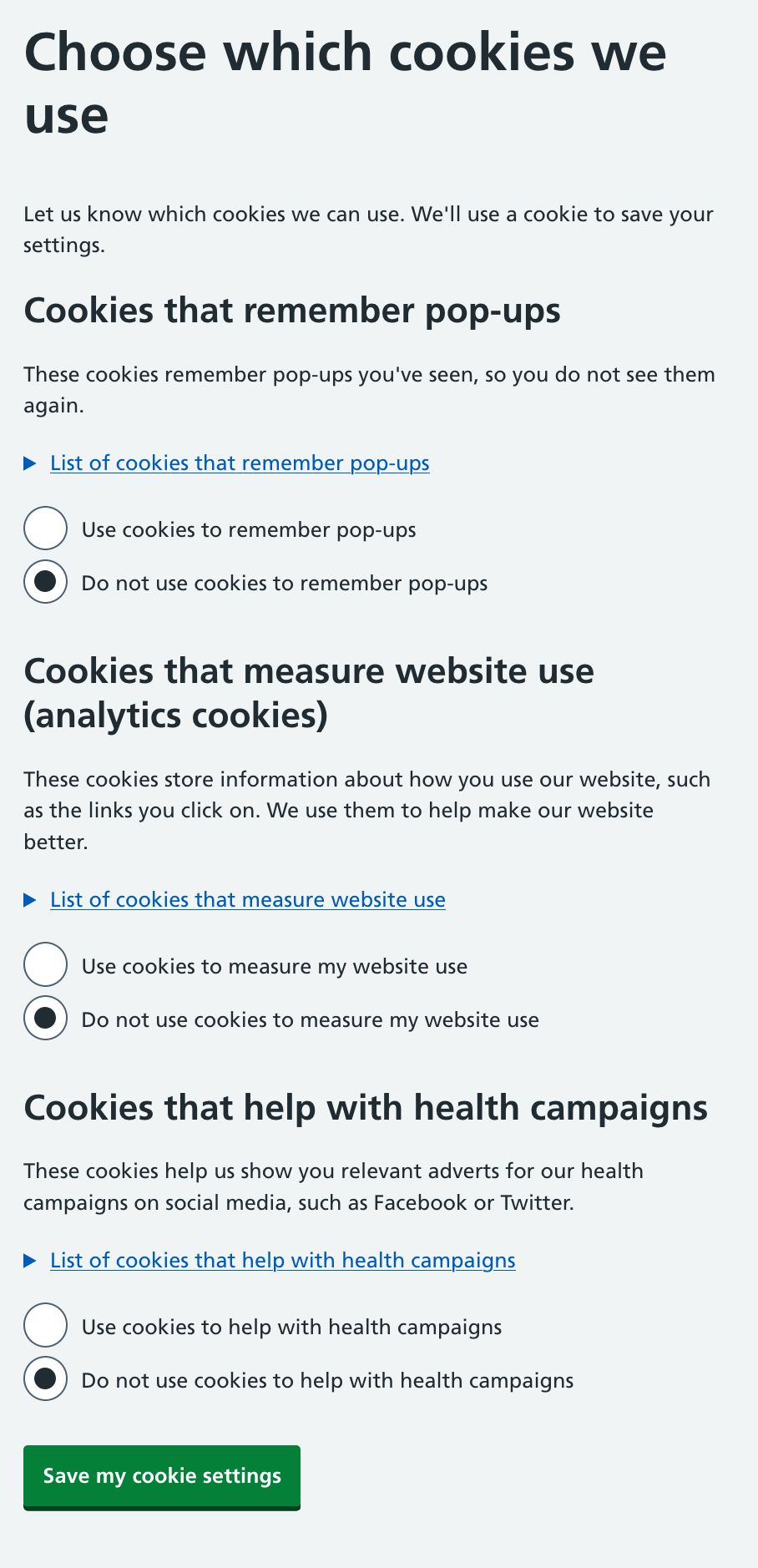
They’re using headings to make what is normally quite dense, complicated information much more manageable. I see here, cookies that remember pop ups, cookies, that measure website use cookies that help with health campaigns, I now know what these specific cookies are doing, and why I might allow them to be set in my browser. I can opt in or out of each of those.
If I really want to dig in further, I can click that link that says “list of cookies that remember pop ups” and it shows those specific cookies.
I have a fully informed, very specific, a very empowering experience here with the cookie settings.
Rather than having no cookie notification, even if you’re setting them or a generic one, design something where you have those specific cookie opt-in settings.
When you’re designing forms, ask , “What do I really need here?” and ask for only only the information that you really need. Be particularly thoughtful about which fields you’re making necessary.
So there you have it, a roundup of Consentful UX.
As far as how to apply this in the wild, I suggest we go back to that design persona. It’s a really great tool. And we can ask ourselves, “Would I do this in real life? Would I do this face to face with other people?” And how am I if I put my design persona in that friendly side of the spectrum, how can my site be friendly?
Also, the closer that we are to our end users, the better the experience is always going to be. So if you have an important call to action, let’s say you have an important fundraiser coming up, and you really want people to know about it. If you want to strike the right balance between informing them about this, but not interrupting their concentration run some usability tests, run some readability tests to watch people actually read an article genuinely. Are there patterns that you’ve put in there designed and developed that are breaking their concentration? And what is the impact of that? So I’ll turn it over now to Johanna to talk about working with stakeholders.
Convincing Stakeholders to Design with a Consentful User Experience Johanna Bates
Yeah, so stakeholders, we have to work with them. It can be really challenging. When we presented this last week, at a Drupal Camp, someone specifically was asking in the QA, “Hey, you know, I believe all that. I’m down with this whole thing, but how do I convince my clients or the board or whomever needs to sign off on the design to get rid of some of these intrusive patterns?”
It can absolutely be challenging to do this. As practitioners, we often see a better way to do things. It’s really hard when really big giants like Facebook and big box retailers and media sites use these patterns. Stakeholders will often assume that they’ve done all their science, and they’ve spent tons of money and they know that they work. So they’ll copy them, and they see a bump in metrics. And they’re like, great, it’s perfect. This is awesome.
So here are three things that I use to help move stakeholders along on this issue.
Consentful UX is Good for SEO
The first is Search Engine Optimization (SEO). This is what I go to when I am also trying to get stakeholders more invested in web accessibility, because a more accessible website often has better search result rankings. That’s something that will often get their attention.
Often, stakeholders will be really singularly focused on SEO in order to get their message heard among all of the other messages out there, which is totally understandable.
In 2017, Google announced quietly that they were going to start penalizing mobile sites that had a modal pop up or interstitials on them. So if you have a responsive website, when it’s on a narrow screen, you still have a pattern like that, your SEO is going to get dinged and you might appear lower in search results. That’s usually a pretty good argument when stakeholders are really worried about that.
Trust and Respect is Good Business
The next argument is that trust and respect is good business. What kind of organization are you? Are your values expressed all the way through everything you do? When you go on retreats and have meetings about your vision, and your mission and your values, are those really making it out to your programs, your content, and your web design?
This is another great moment to use that persona and skit where you imagine, if my organization was a person and they’re interacting with someone we’re trying to talk with on the web, what does that interaction like? Is it like Clayton’s Biz Tips? Because if so, you may want to revisit some things. No offense, Clayton.
Go Beyond Vanity Metrics
Vanity metrics are quick bumps in numbers that people tend to watch. Mobilization Lab has a really good, more in depth process for how to create deeper questions to track your metrics and success in your organization. I highly recommend checking that out if this interests you.
Their definition of vanity metrics is data that is easily manipulated and biased toward the short term, often painting a rosy picture of program success. They do not help campaigners make wise strategic decisions in the long term.
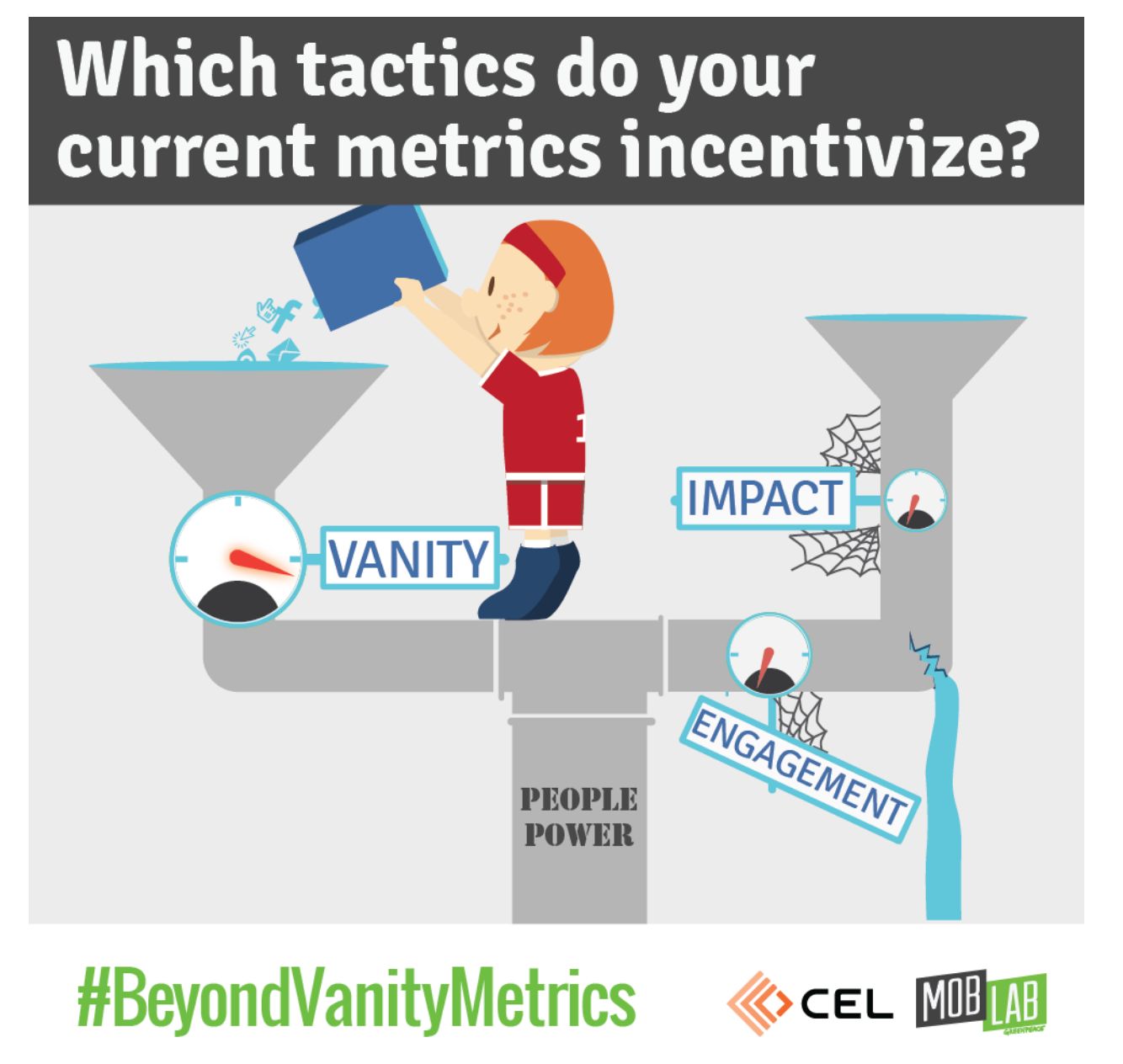
Vanity metrics aren’t necessarily bad or useless. This is just a frame for how to look at some of these things in a different way. If you ask deeper questions about UX, such as, Are my values being expressed all the way through my UX? You may find there are better ways to engage your audience, other than by just widening that funnel to capture anyone and everyone in hopes of making conversions.
Unfortunately, this is not a quick fix solution. It’s going to be unique to every company or organization and it will take some time. So, yes, I’m sorry that that is a little bit more work. But again, in the next slide, here are some links, and we’ll figure out how to make these available to you.
That about wraps up our presentation. Thank you very much for hanging out with us to talk about this.
Questions and Answers
Clayton
Somebody made an interesting point about the the privacy eye icon and how it follows the users. It stays persistent on the page. Maybe there’s a better way of implementing that.
That is the world of UX design, trying something and then iterating over that. I’d be curious to see how it’s landing with people right now. Maybe it is or maybe a more effective pattern would be something where you see it, but then you have the option to close and be like, “Yeah, I got it. This is a privacy browsing site.” Or maybe people are fine with it and it’s not bothering them because it’s lower on the page. That’s the fun of this work.
Johanna
I also think that we don’t have to never use any of these patterns, but how can we make them a little better. For example, it doesn’t move, it doesn’t bounce up and down, and it’s not animated that I’ve noticed. We’re all on the internet, we use some of these patterns and sometimes we need to use them. Making this an all or nothing framework is not necessarily gonna move us forward. There are use cases where some of this does make sense, but as I’m sure everyone has experienced when you feel beleaguered at the end of a day of reading a couple articles then maybe it’s time to reflect on what we’re doing.
Clayton
“In response to unsubscribe links, I’ve seen a lot of companies and organizations moving towards a, “Want to hear less?” option on the unsubscribe page. So it’s not so all or nothing.”
Yeah, and I’ve seen this work. I’ve seen this both work well and not work well. So the consentful approach would be, yeah, maybe there is an option there to hear less. But there’s still that prominent link to just unsubscribe from everything. The coercive pattern is either not having that and just showing the, okay, you can hear less from us, or making that unsubscribe from everything intentionally less prominent and harder to find. Ddoing that well is following that specific principle that we looked at.
Johanna
Also, I just want to say that I don’t know about other people, but I feel like in the last couple years, I find that I’ll purchase something, or I’ll sign a petition, or I’ll sign up for a list and I will literally make sure that that the button that the box that says send me email is unchecked because I am vigilant about that. I do not want email and I am auto subscribed every time.
It’s like when I go to those those automatic hand dryers that don’t see me. It’s like that. I’m doing a thing. In a bathroom, when you put your hands under and those don’t see me, it’s like, I don’t exist. I feel like I’m clicking, “Don’t send me an email.” And whether it’s Crate and Barrel, or some left wing petition that I’ve signed, I’m absolutely hammered with emails and texts. I did not sign up for anything. And I would text stop to every single one and I would just get another one. I couldn’t even tell sometimes if they were the same one, or a different one. And I supported these issues. I know that these issues are really important. We’re just trying to capture people’s attention. It’s really hard, but when it makes people angry, it’s really worth questioning it. And that’s really all we’re saying.
Clayton
Yes, amen. I’m invisible to those hand dryers and to bartenders, just overlooked all the time.
We got a question from Mica, “Do you think it’s okay to test and learn with consentless techniques? And then if they make a big difference to our KPIs? So for example, in terms of petition signers, try to improve them in iterations and make them more and more consensual over time?”
Hmm. Yeah, I mean, I think this is one of those questions that it depends on your situation and your users. But I think generally that that’s a good way.
Johanna
I’m personally just not a black and white thinker on these things. Possibly that’s because of my interest in accessibility work. Whenever I talk about making websites more accessible there, you could do that for forever. It’s been most most successful when I tell organizations, let’s go through your top 20 blog posts and get an intern to add alt tags and headers to those top 20 blog posts that we know from your Google Analytics are the most read. That’s better than doing nothing. I think that this is the same thing. Don’t let perfect be the enemy of good or better or improving.
Clayton
I would stress the value of doing the qualitative research around this. It’s hard to see the quantitative side of the the impact that these coercive UX patterns have. As Johanna pointed out, you can drive people away from your site, if you have too many aggressive coercive UX patterns. Sometimes that’s hard to see in the analytics.
It’s really valuable to set up a user test, have someone come to your site, have them come genuinely read an article, read a petition, and see firsthand what that experience is like. If it’s empowering, it’s really exciting. If you see patterns that are distracting people or frustrating them, then that’s a real eye opening experience. That can be a really great insight to share with those stakeholders who might be skeptical about paring down the coercive UX patterns.
I think we’re almost at time. I don’t see any more questions. And Johanna, did you have any final final words to share?
Johanna
No, just thank you to everyone. And thank you to Greenpeace for giving us the space to present today. Thank you, Nikos.
Nikos
Of course.
Clayton
Yes. Thank you.
Nikos
Thank you everyone for attending and participating.
Johanna
Oh, now’s the awkward time where I have to get out of zoom.
Transcribed by https://otter.ai and then cleaned up by us humans.


Leave a comment