The Entertainment Community Fund (ECF) provides a safety net of services for performing arts and entertainment professionals. They have the good problem of having so many programs to offer that entertainment professionals often don’t realize ECF can help them.
A user survey conducted in February 2023 concluded that, “Awareness of ECF services is low. Slightly more than 50% of respondents were aware of ECF’s emergency financial assistance and career center services. Less than 40% of respondents were aware of the housing education workshops, housing/residences, NYC health center, senior care services, and young performers programs.” The analysis went on to conclude that, “steps should be taken to increase awareness of all of ECF’s available services.”
We looked at ECF’s website to see how services were being organized and communicated to users.
A heatmap analysis of the Services & Programs page showed that only 52% of users are scrolling far enough down the page to see the second and third row of service pages. On mobile less than 50% of users reach the “Find Housing” link and subsequent service pages.

An analytics report shows that of the 8,160 visitors to the Services & Programs page, only 25% clicked through to a service page. Of those who did, 54% visited Social Services & Financial Assistance, followed by a sharp decline for other services. The data shows that there is a direct correlation between the order of the service in the grid and number of visitors.
How could we better convey the over 50 services that ECF offers?
We hypothesized that introducing a dropdown menu would allow users to quickly scan all of ECF’s services, easily navigate directly to the service page that meets their needs.
Designing a Dropdown Menu for 122 Links
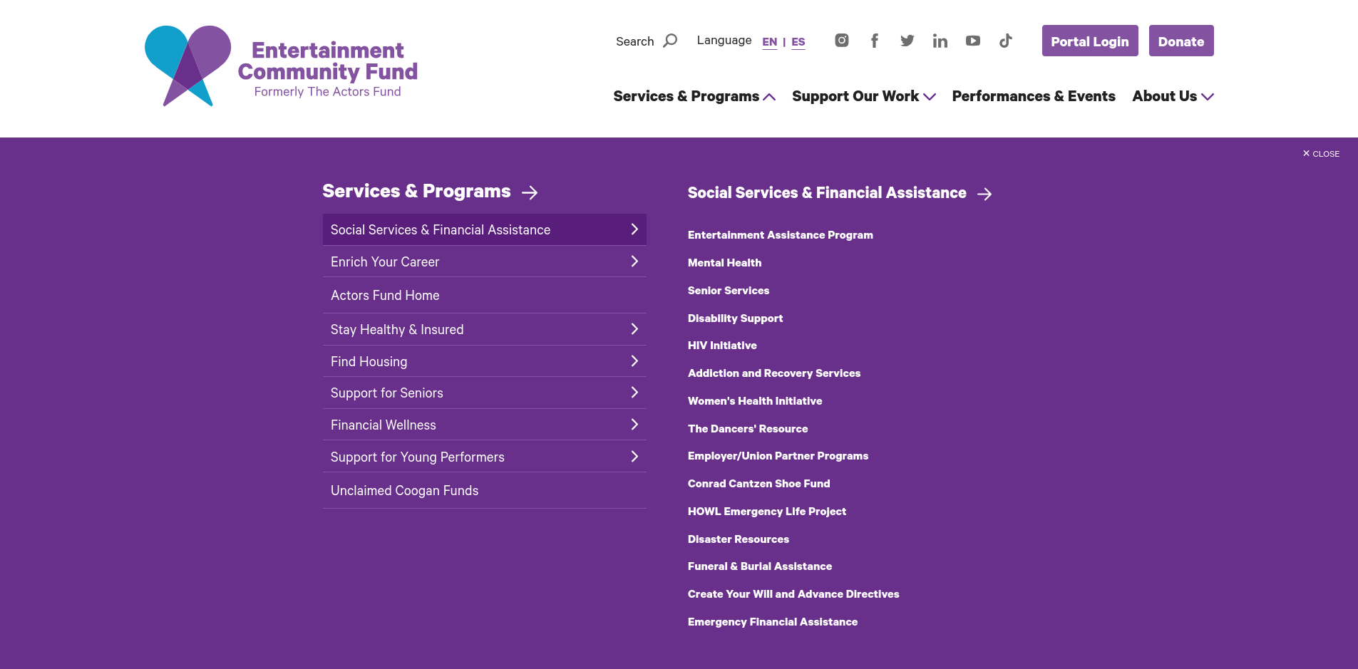
The Programs and Services section of ECF’s sitemap contains a hefty 58 menu items, with nine subsections descending four levels deep. We needed a menu that was comprehensive but not overwhelming.
We turned to large, complex sites for inspiration.
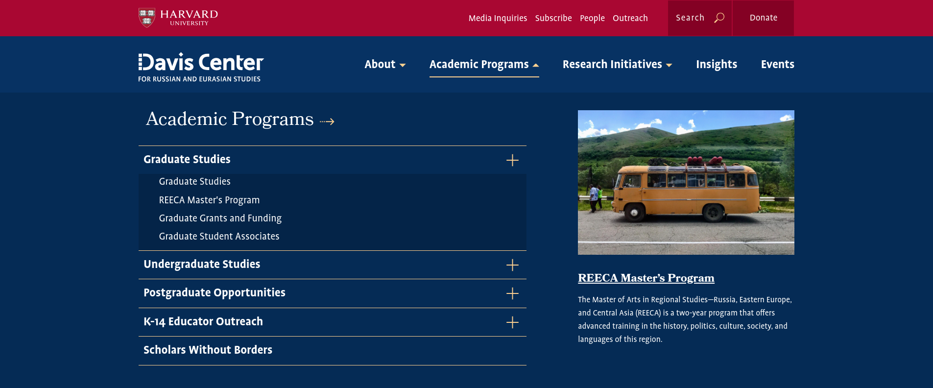
Recently we improved Harvard University’s Davis Center for Russian and Eurasian Studies menu to accommodate their wide and deep navigation system.

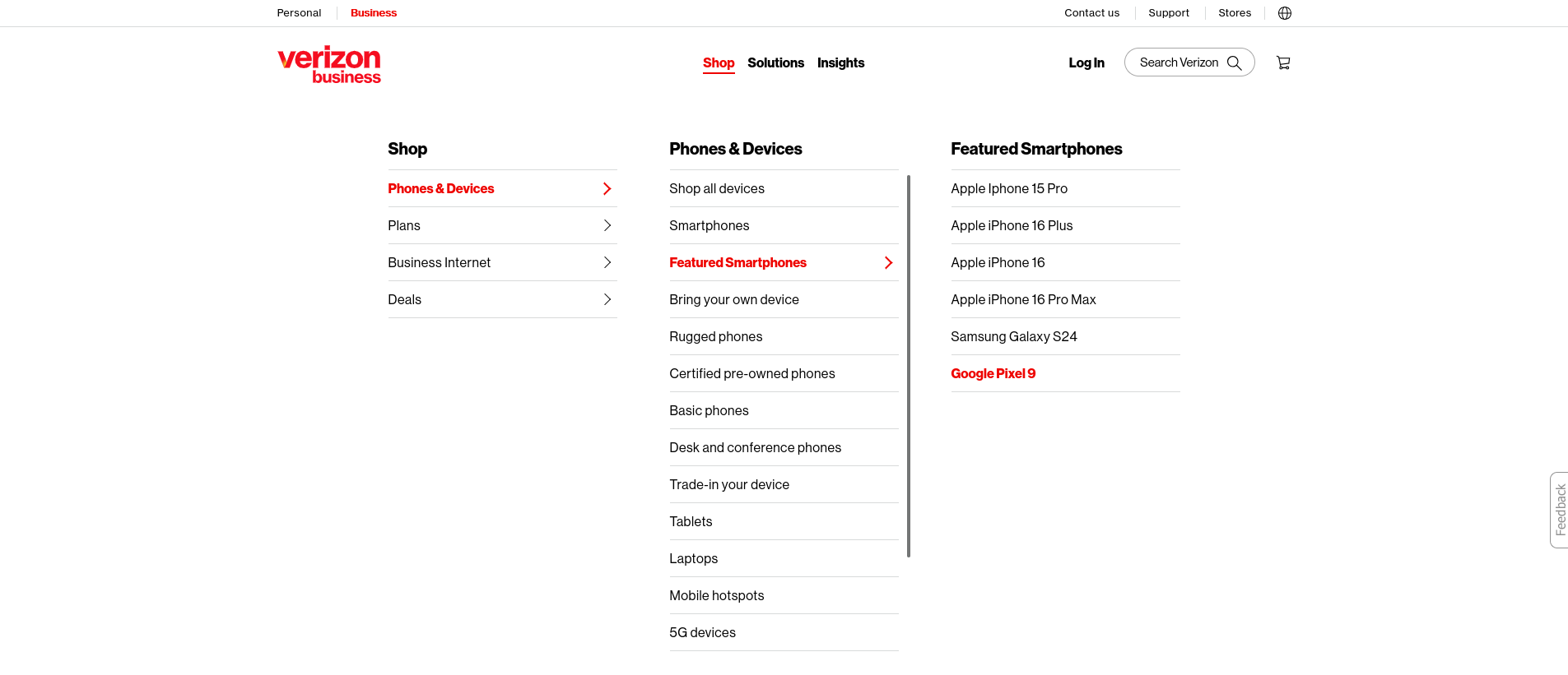
We also appreciated the way Verizon’s menu displays its many services.

Many ECF constituents are seniors with diminished fine motor skills. We liked the way Verizon’s menu displays its many options, but felt that Davis Center’s click to expand method would be easier to use than expanding menus upon hover. A shaky hand could leave users accidentally switching sections unintentionally.
Here is the end result.

So Did It Help?
It’s been four months since we launched the new dropdown menu, enough time for the dust to settle, so we took a look at the analytics.
One thing to keep in mind is that 2023 was the writers and actors strikes, a time when ECF was a lifeline for entertainment workers. The site experienced historically high traffic.
Comparing October 2023 to October 2024 we have to take this into account.
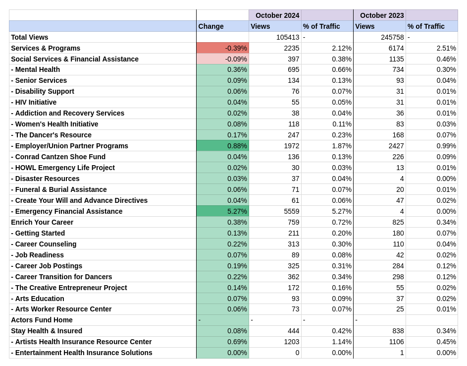
A meaningful metric to judge the updated navigation by would be, of the total traffic to the Services and Programs section, what percentage of that traffic is to interior pages? It is after all specific program pages, such as the HIV Initiative Page or Emergency Financial Assistance page where people are going to get their needs met, not the high level pages like Social Services & Financial Assistance.
What the analytics show is encouraging. While high level pages like the main Programs & Services page saw less of the overall traffic, specific program pages all saw more visits (the Emergency Financial Assistance Page a whopping 5.27% more). This tells us that ECF site users are better able to get directly where they needed to go.

By presenting ECF’s services and programs prominently in an easy to use mega menu, users quickly see all that is available to them, rather than requiring them to drill down page by page to ECF’s many offerings. By presenting users with their options in a more intuitive way , more entertainment workers are getting the support they need.

Leave a comment