After we launched the Bay Area Legal Services’ (BALS) redesigned site in October of 2019, we kept tabs on their analytics. The numbers were, far and wide, positive. More page views, more time on site, increased mobile traffic, everything you wanted to see. Except for one section: Resources.
Resources, or helpful links covering a variety of relevant topics, is almost always an odd duck on websites that aim to equip people to take action on behalf of themselves or a cause. “Resources” often ends up as a political parking lot, a list of under-used links. We do our best to encourage clients to contextualize “resources” in ways that are meaningful to their users. Sometimes, we need user data to guide us in how best to do that.
The BALS site largely uses a question and answer format to inform people about their legal rights, but there are important other organizations and sources of information that are of utmost importance to make available to people seeking legal help. So in the first iteration of their site, we built a resources section, and decided to measure its effectiveness after launch.
As we guessed might happen, analytics confirmed that resources always played second fiddle on BALS’ site. Resource pages saw noticeably less traffic, with some pages going weeks without a single page view.
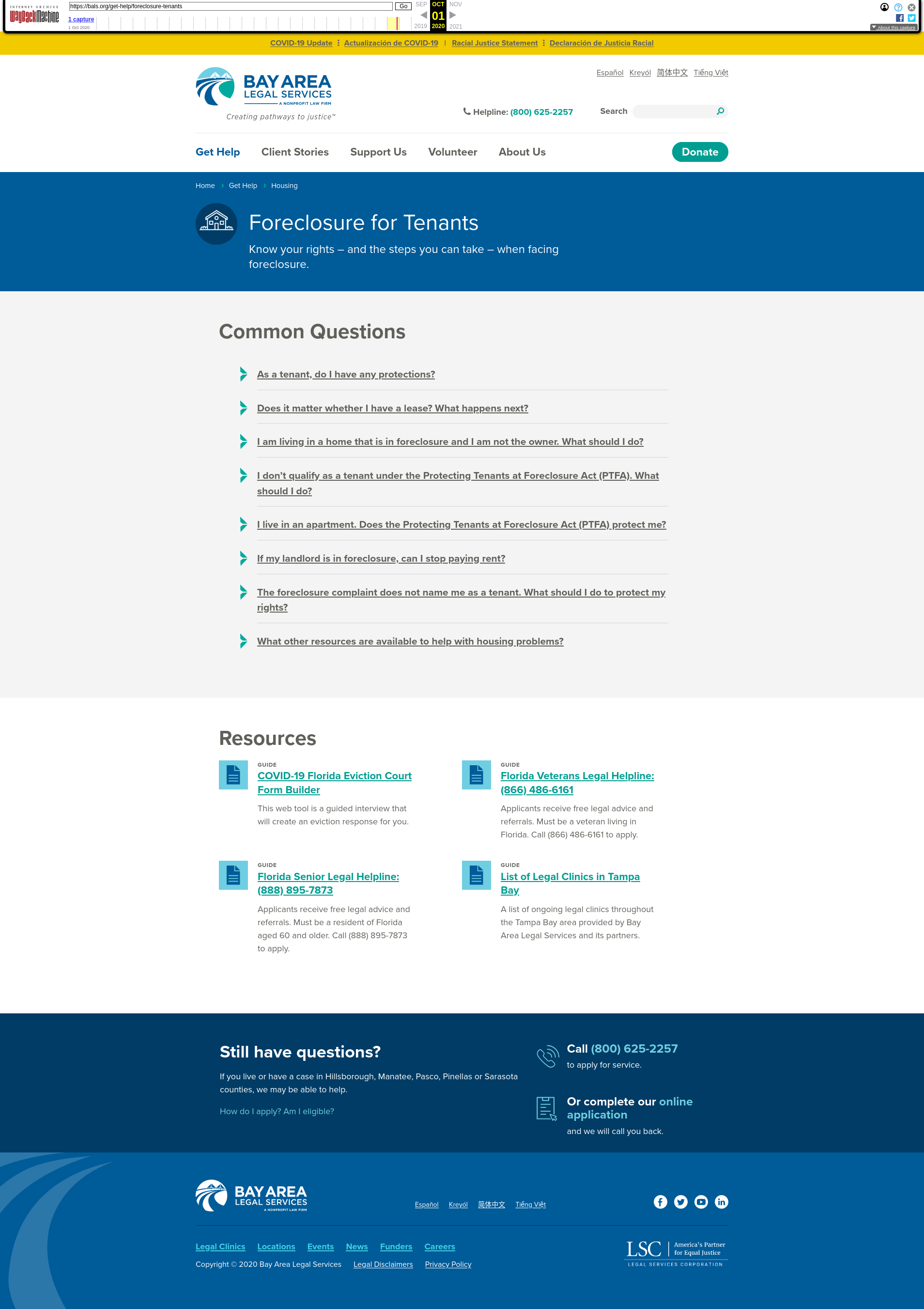
Here’s a screenshot of the page as it existed then:

We had a few hunches about what was going on:
- People found the answer to their question via the Q&A section, and didn’t need to scroll down further.
- Too many listed resources led to users’ decision paralysis.
- With so many words together, users’ eyes avoided the block of text altogether.
We decided to conduct usability tests to test our hypotheses.
We recruited three people to kick off our research. All three represented some of the most difficult-to-reach members of BALS’ target audiences: they were low-income workers, had low technical skills, and they primarily used mobile devices with limited data plans to access the internet. One interviewee exclusively read and spoke Spanish, and we worked with a translator for their usability test.
In all three tests, users responded positively to the question and answer format. One person’s question was answered in the list, but two others had questions that weren’t covered by the Q&A. All three scrolled right past the Resources section.
Once the Resources section was pointed out to them, each read the Resource titles only, and all three testers saw one or more resources with information helpful to them.
When asked why they skipped past it initially, they couldn’t give a definitive answer.
Our interpretation is that it came from our third hypothesis:that the amount of words in a block of text prompted the user to simply skip over it. The cognitive load induced by the task of reading all of that information, especially in two columns, was too much. Even when they read the Resources section after it was pointed out, they stuck to the titles only. The summary text was only getting in the way.
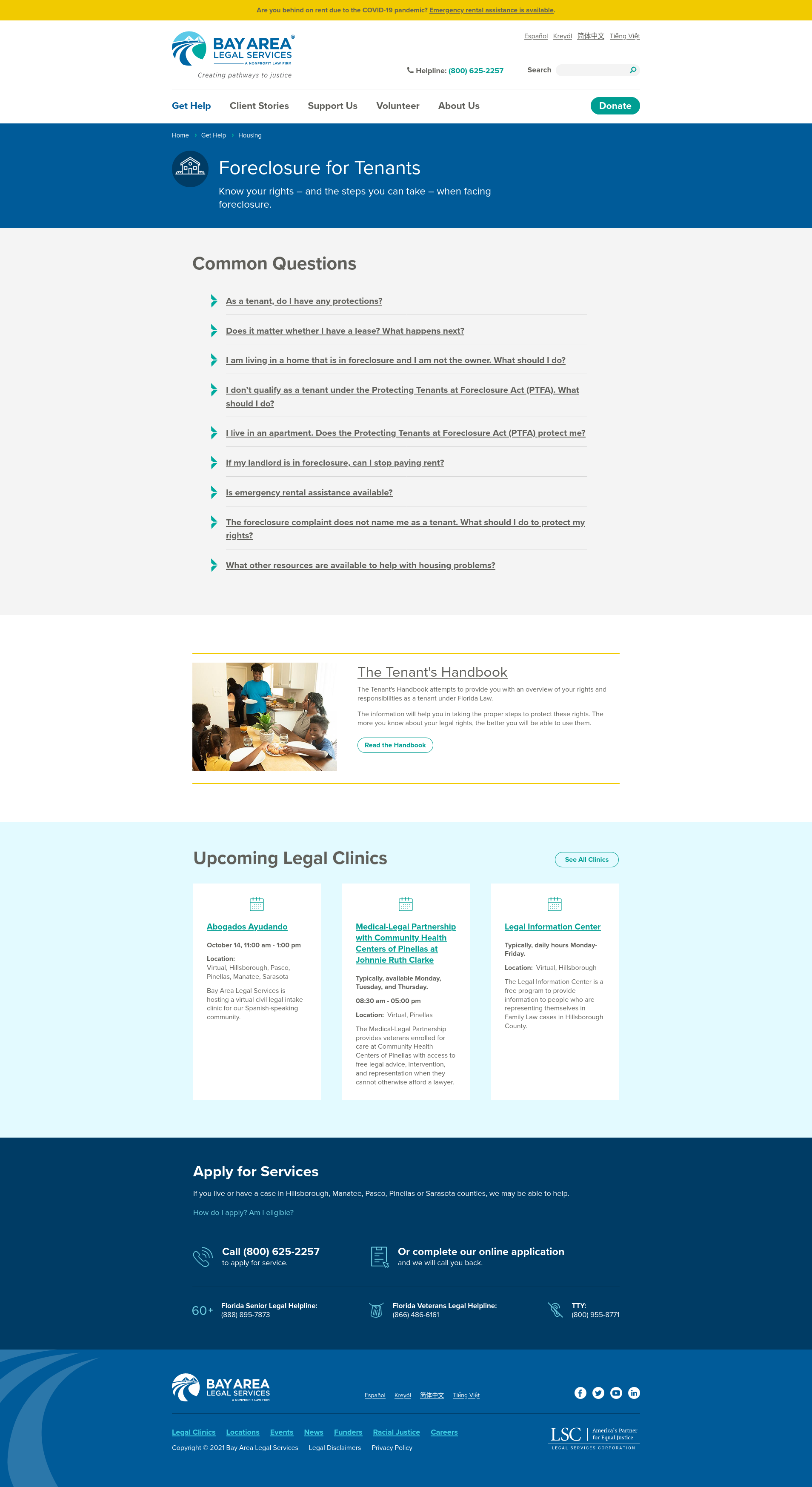
Together with BALS, we decided that strategically, only a handful of the dozens of resources are especially important to get in front of people. The BALS site’s theme already had an existing block style designed to promote key content. As an inexpensive experiment, we decided to use that block to highlight one resource. Then we used analytics to measure the results.

Analytics showed that results from the change were almost immediate.
Before the change, the tenant’s handbook was getting at best five views a week.

We made the switch on October 4th. As you can see, a sharp incline in traffic occurred after simplifying to a single featured resource.
The resources changed URLs as a result of some related information architecture work we did to improve SEO, which is why you see a sharp, temporary drop in traffic at the end of October. Here is analytics for the same Tenant Handbook page, with the new URL from October through December 2020.

As you can see, page views tripled from about five page views a week to 45 and then continued to climb in December to 60-75 pageviews/week range.
In the end, this change to the website didn’t require any custom development, just a shift in the way the content was prioritized and displayed.
With a concerted outreach plan by Bay Area Legal Services and improved search relevance, this essential resource is now accessed by hundreds of people per week, at a crucial moment — the unfortunate end of the COVID-19 eviction moratorium.

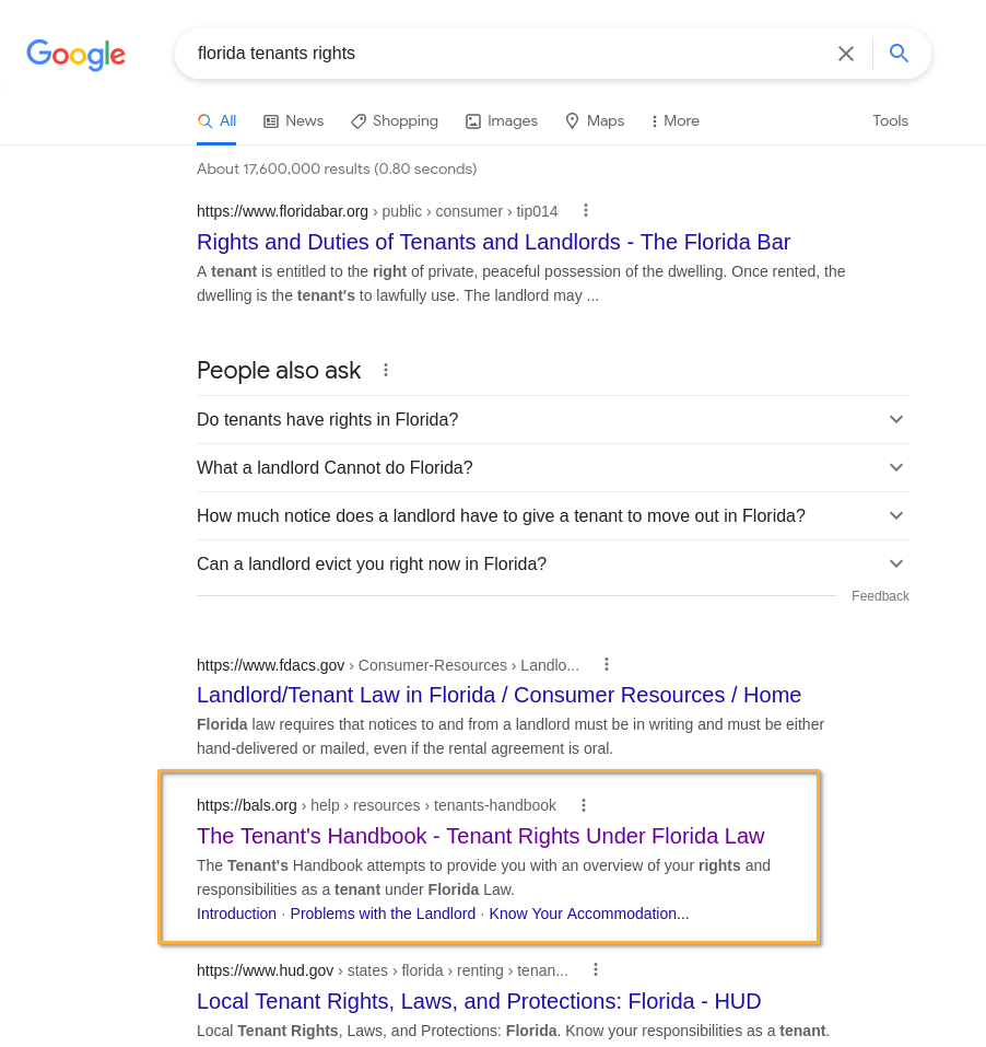
With more visibility, this critical resource is now a top search result for the many Florida residents in housing precarity wanting to know their rights.

By keeping an eye on analytics, noticing trends, and reaching out to users, we identified an important adjustment to make to the BALS website to better reach audiences. For nonprofits offering critical services, these seemingly small changes can make a world of difference to the people they serve.

Leave a comment