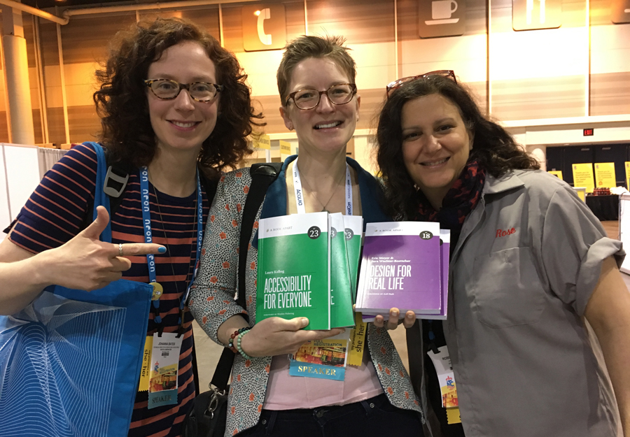
On the heels of the DrupalCon Nonprofit Summit, I made my way to New Orleans for the 18NTC. The NTEN NTC is my career conference-home. I have been attending the NTC for 15 years (I think? It depends on what you count as the first-ever NTC). When I was an org staff member, this conference was my source of ongoing learning and support. Many of my business partners, to this day, are people I met there.
This year, I teamed up with fellow DevCollab team member and content strategist Eileen Webb, and Rose Liebman from Advomatic, to talk about accessibility “beyond the checklist”: content, design, and code accessibility. Our goal was to give people who are not necessarily coders or developers a few things they can pay attention to, or do themselves, to improve accessibility on their sites. And along with that, to help people convince others in their organizations that website accessibility is a social justice issue. It needs to be prioritized, and baked into processes, wherever possible, not just maybe added later, as an afterthought.
Who needs accessibility?
Website accessibility is about preserving access to information. Who deserves access to information? Here’s a partial list:
- people who are blind or have low vision
- someone who can’t use a mouse
- people who have trouble with focus and attention
- folks with cognitive processing disorders
- a person with a broken arm
- someone looking at your site outside on a sunny day in bright glare
- a low-income user who exclusively uses a phone to surf the web on a data-capped mobile plan, and
- people who are using the web while stressed out.
If that sounds like it covers almost everyone, you’re right. Everyone. Everyone deserves to be able to use the web, and we lose users we would otherwise have when we don’t prioritize accessibility.
Better for someone, better for everyone.
Eileen talked about how to make content more readable by reducing the amount of content, structuring it well, and using words that will be clear to your audiences. Rose talked about concrete ways to cultivate empathy for users, and how to use that empathy to guide all design decisions. I talked about some basic code things you can do to preserve the accessibility that’s inherent in properly-coded HTML, to keep forms friendly, and to make sites less slow and expensive to load. When we have better contrast in our site designs, and our content is not a wall of text, it’s easier for a stressed out user in midday sun to use, as well as for someone with low vision. Win win.
Progress, not perfection.
The scope of improving web accessibility is much broader than a list of WCAG requirements; there’s art to it, as well as science. It encompasses editorial choices and visual design decisions, as well as code. There are so many little improvements you can make that will keep you from losing users. Focusing in on one or two of our suggestions—wherever you’re able to—is fantastic. Here’s a link to our notes doc with a reading list and our PDF slides.


Leave a comment