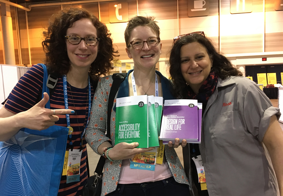
In honor of Ada Lovelace Day, I'm going to give some attention to the topic of responsive sites, on which I've been brewing thoughts for a while. It's hard to do anything in web design and development right now without hearing the term "responsive design" until your eyes glaze over. For anyone who needs a primer, I like this one from Treehouse. Responsive is a great concept. An increasing number of people are surfing on phones and tablets, and they expect to be able to do almost anything on their devices that they can do on a desktop. There are use cases where developing a device-detecting mobile site or an app is the better way to go. But much of the time, building one website that can adapt to different screen widths, using media queries, is a very elegant solution.