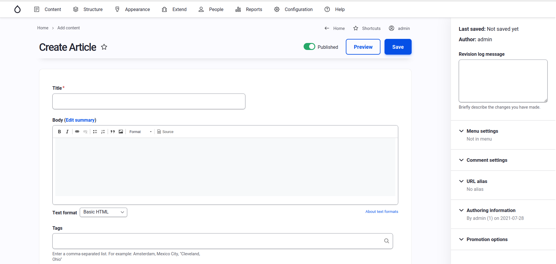
In our first post, we saw the big difference that switching our Drupal website to the Gin admin theme can make for sighted users. Gin’s approach to spacing, its clean icons and soft color palette allows the elements on the page to breathe more freely (and we authors as well!). There are so many elements on this page, however, that the interface can still feel overwhelming.
Remove Unnecessary Elements from the User Interface
The many form fields, labels and help text on this page brings up another law of UX. Hick’s Law states that,
The time it takes to make a decision increases with the number and complexity of choices.
If, for example, your website does not use the “Promote to front page” or “Sticky at top of lists” functionality, then you can remove the Promotion options working tab altogether. Often, articles are configured to automatically appear as children of a landing page (such as “News” or “Events”). In this case, the Menu settings need not ever appear for authors.
Remove Unnecessary Form Components using the Manage Form Display Feature
Drupal has a very handy feature, which is an interface to enable and disable form components. Head on over to the Manage Form Display for the content type, block, or other entity you want to improve. In the screenshot below, we’re cleaning up the Article form at Structure > Content Types > Article > Manage form display:
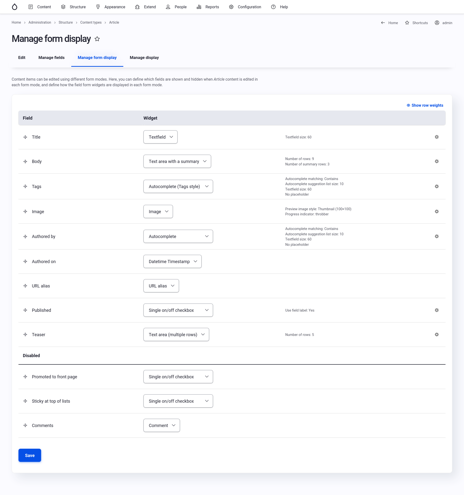
In this case, I won’t ever need to use Promoted to front page, Sticky at the top of lists, or override the default Comment settings.
Remove Unused Features on the Content Type Settings Form
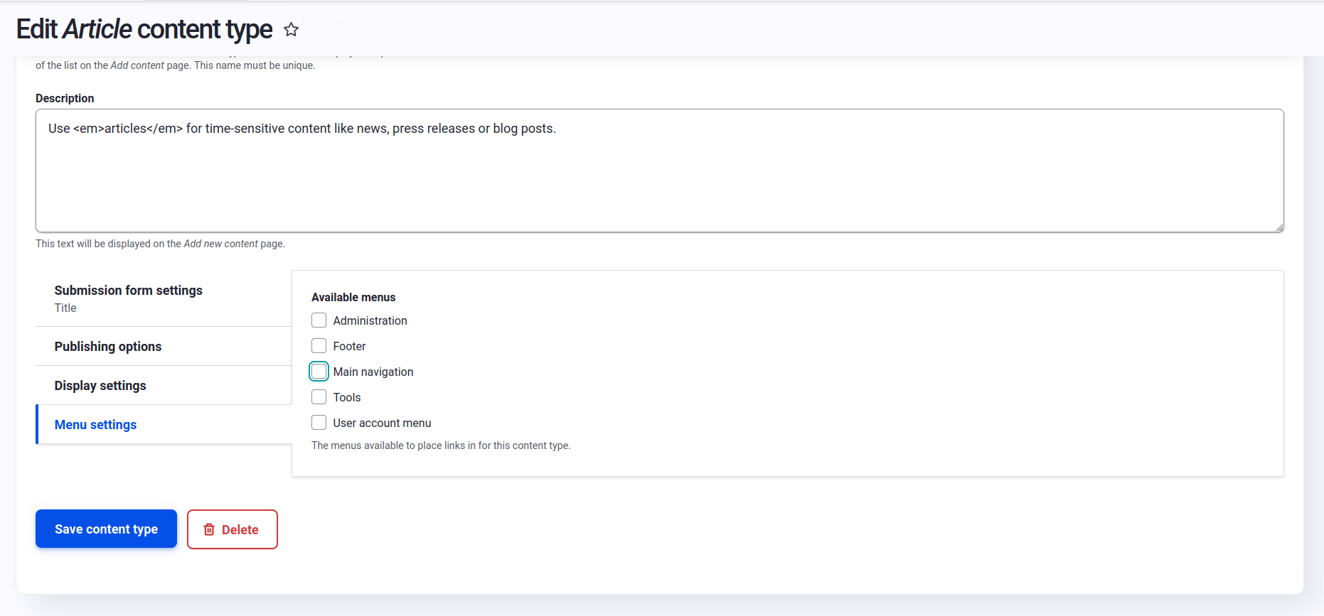
To remove the Menu Settings working tab, edit the Article’s general settings at Structure > Content Types > Article > Edit
(Be sure that, for your website, the content type you’re modifying is being added to the correct menu section in another way before doing this.)
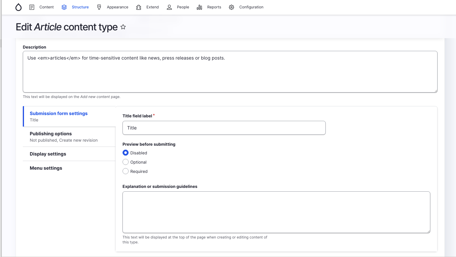
On that same form is the option to disable the Preview feature. I’ve always preferred to look at an unpublished version of my content than rely on Drupal’s Preview feature. (It is always wise to check with your content editors before making these changes, to be sure they’re not using the Preview feature before removing it.)
Uninstall the Comment Module
The Comment module is enabled by default on Drupal websites. If your site doesn’t use comments, then there’s no need to keep the module installed. Before uninstalling the module you will first need to delete the comment field from each content type. You can do this, fore example, on the Article content type at Structure > Content Types > Article > Manage fields.
You can then uninstall the Comment module at Extend > Modules > Uninstall.
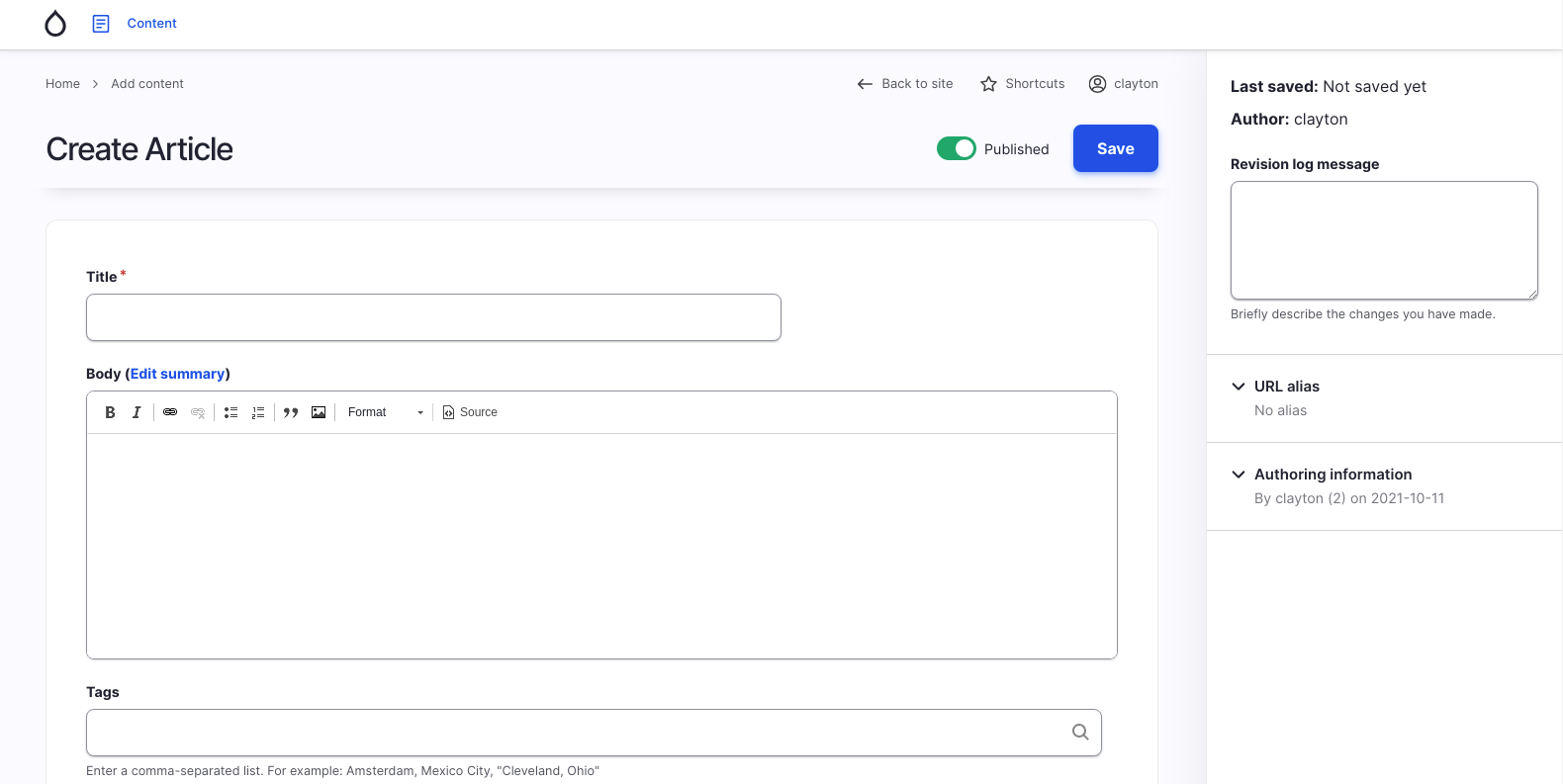
Now our streamlined form looks like this.
Limit Allowed Text Formats
This is great, but we can streamline this even further. That Text format select list isn’t necessary. If there’s not a reason to provide multiple text formats for your users, you can choose an appropriate text format that works for that field every time, and declutter their editor even more.
To do this, we’ll install the Allowed Formats module.
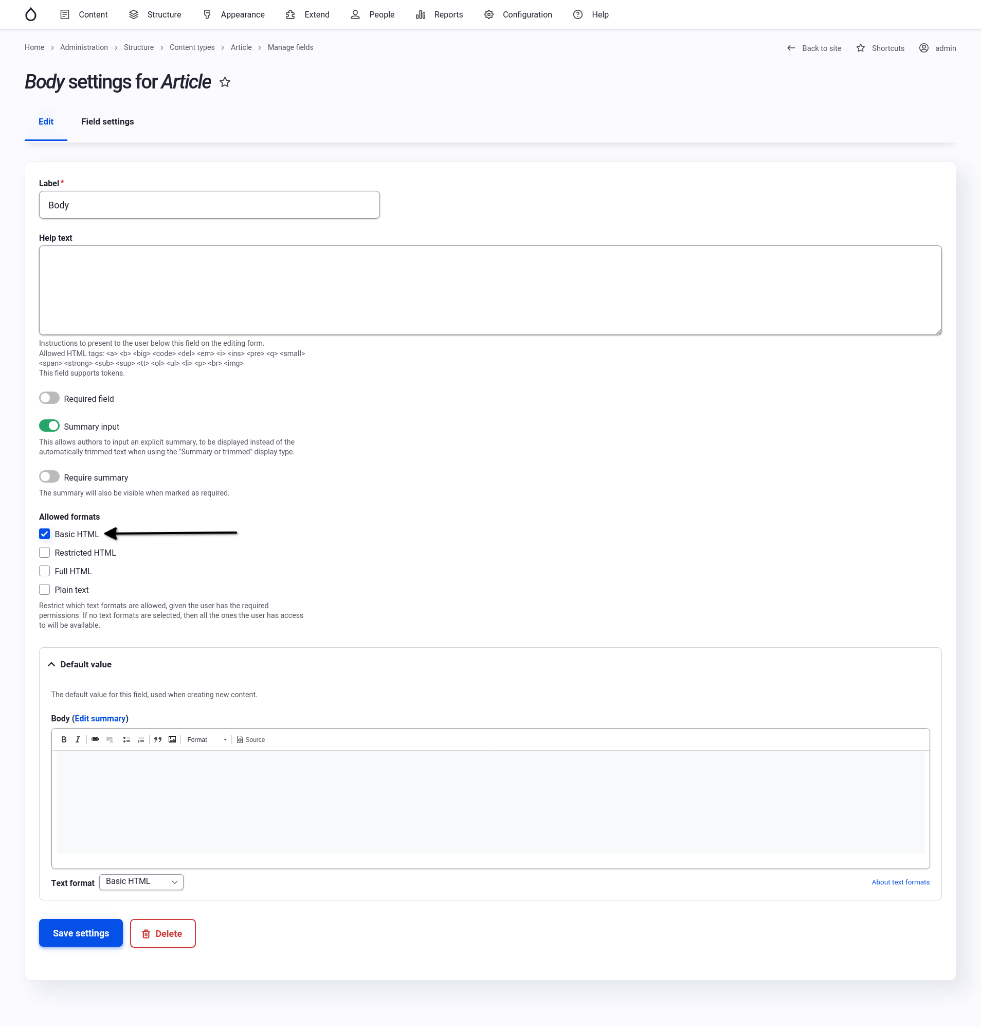
Once enabled, you can edit the field in question and choose the single, appropriate text format to use. In this case it’s the Body field settings at Structure > Content Types > Article > Manage fields > Body:
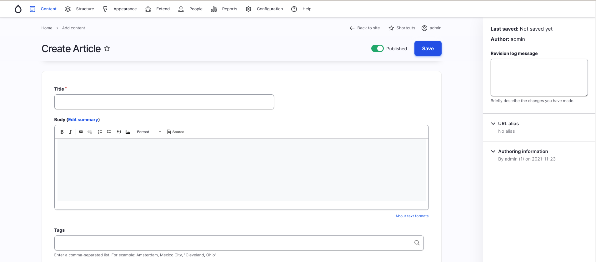
Now that pesky text formats select list is gone, giving our authors one less thing to worry about.
Hide the About Text Formats Link
Speaking of text format cruft, when did you last click that About text formats link? The Allowed Formats module let’s us get rid of that text too.
Head back to the Manage Form Display page for the entity in question. In this case Structure > Content Types > Article > Manage form display > Body:
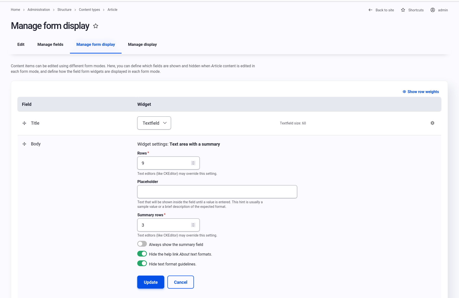
Now our form is cleaner and easier to work with.
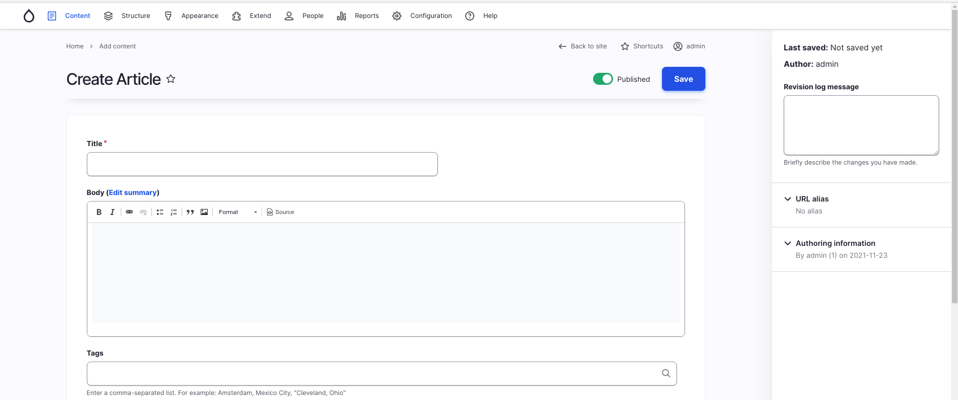
Fine Tune Permissions
Drupal has a very granular set of permissions and the ability to create as many roles as necessary. Despite this, it’s common for sites either to have skipped defining sensible roles, or the permission needs of the team have evolved over time. Instead of updating roles accordingly, people will simply elevate their role to the most permissible to avoid permission roadblocks. While preserving legacy roles is a quick, convenient fix, unnecessary permissions lead to overwhelming interfaces.
Here is a sample administration menu that an administrator may encounter.

Yikes. That’s a lot of options.
Here is what the menu for a content editor can look like when their role has only permissions relevant to content management.

Hide Irrelevant Administration Menu Items
But wait. I didn’t grant the content editor any permissions related to Structure.
Sure enough, if I click on that Structure link this is the message the user gets:

Not exactly the most helpful page.
This is a longstanding Drupal bug. Luckily, there is a contributed module that fixes this problem. It’s a submodule of the fantastic Admin Tool bar module called Admin Toolbar Links Access Filter. If your site doesn’t already have this installed, I highly recommend it. It provides a nice dropdown menu for the administration toolbar.
Once enabled, those irrelevant links go away.
Hide the Unhelpful Help Link
The last thing I would hide here is the Help link. The Help page is a list of every enabled module’s help pages, which are written for developers and site builders, not content editors.
Unfortunately, the permission to see administration pages is coupled with the permission to see the help pages.

There is a reported issue in Drupal’s issue queue. Some progress has been made, but if you have the skills to push it over the finish line, I will send some money your way to buy your favorite beverage. I am serious.
We can, however, hide that unhelpful Help link by creating a custom CSS file for Gin.
- Name your file gin-custom.css
- Place it in /sites/default/files
- The CSS you want is
.menu-item.menu-item__help-main {display: none;}
Fix Drupal’s Funky Content Permissions
Another odd choice in the Drupal permissions system is that the ability to see unpublished posts authored by other users is lumped in with the ambiguous “Administer content” permission. There is an issue in Drupal core about this.
For now, install and enable the View Unpublished module for more sensible permissions.
On a related note, users cannot publish content they didn’t author without that “Administer content permission”. Install and enable the Publish Content module to remedy that.
By taking advantage of Drupal’s granular permissions and configurable forms, we’ve streamlined the user interface to focus on exactly what an author needs and nothing more.

Of course, some of your content types on your Drupal website might be more complicated than this example Article. In the next post in this article series, we’ll use the power of association to group and order fields logically to improve the usability of form fields themselves.
Part 2: Conclusion
As you can see, there are many ways to improve the authoring experience of your Drupal website. Use this post as inspiration for the changes you can make. Above all else, learn what is most important to your authors and use the Laws of User Experience Design to make your website enjoyable to use.
Read More: Enhance Your Drupal Website’s Authoring Experience
Open Read More: Enhance Your Drupal Website’s Authoring Experience configuration options

Leave a comment