Series Introduction
I’ve seen, time and again, the difference a clean and modern website editing interface can have on both the quantity and quality of site content. When a website’s back-end is frustrating and unappealing to work with, it dissuades the author from posting.
Historically, Drupal has been known as a powerful CMS, and its admin forms are some of the best in terms of their accessibility. But because it can do so much, its admin interface can be difficult to use if not given some love and attention.
Luckily the project has made big strides when it comes to usability. However, many Drupal websites are not taking full advantage of these newer features.
Some recent updates to Drupal core and modules (add-ons for Drupal) offer significant improvements to the Drupal editing interface. In many situations, I actually find Drupal to be easier to use than WordPress.
Many of these admin UX improvement modules only take a few hours or less to add to your site. It’s not rocket science to make editing in Drupal 9 more pleasant! Some minor modifications can go a long way. In this series of articles, we’ll share with you some of the best ways we’ve found to improve the Drupal editing interface. We will show you, step-by-step, how these enhancements can make things easier and more pleasant for website content creators and editors.
Here are the posts published so far:
- Part 1 - Modernize the Admin Theme with Gin (this post you’re reading right now 😉)
- Part 2 - Declutter the User Interface
- Part 3 - Improve the Field User Interface
- Part 4 - Fine Tune Admin Pages
- Part 5 - Accessibility Tools & Conclusion
Gin: Improve Usability by Upgrading Aesthetics
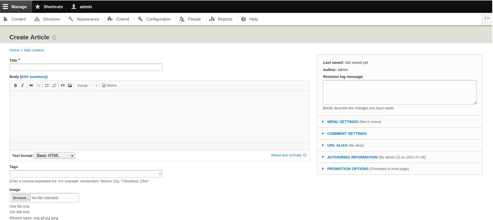
Many Drupal websites are using the default administration theme, Seven. Here’s a screenshot:

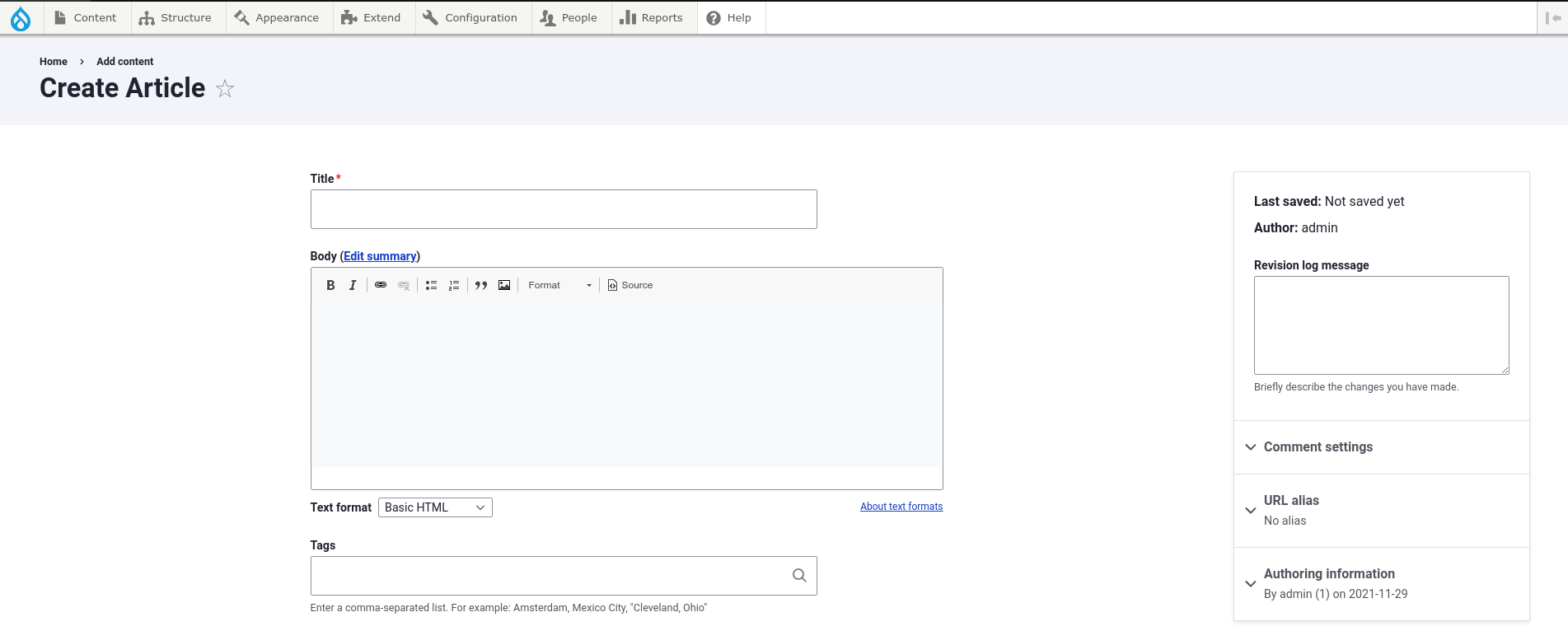
Seven is stable and reliable, but feels like editing from the 90s because… well that’s when the theme was first designed. A lot of work has gone into a new and improved admin theme called Claro. It is now available as an experiment theme within Drupal core. Here is that same form, but using the Claro admin theme instead.

The visual editing interface of Claro is brighter, cleaner and easier on the eyes. It’s a big improvement from Seven, but we can kick things up another notch with a contributed theme called the Gin Admin Theme. It’s a sub-theme of Claro that brings even more polish. Because it’s a contributed module and not in Drupal core, it has the luxury of moving quicker with its development than Claro can. Gin is widely-used, stable, and well-maintained theme. I highly recommend it.
You might think, “well Seven works just fine for us.” You’d be surprised, however, at how much a clean, modern theme changes how folks using a visual editing interface feel about using your website. This is because of a phenomenon called the aesthetic-usability effect. It means that,
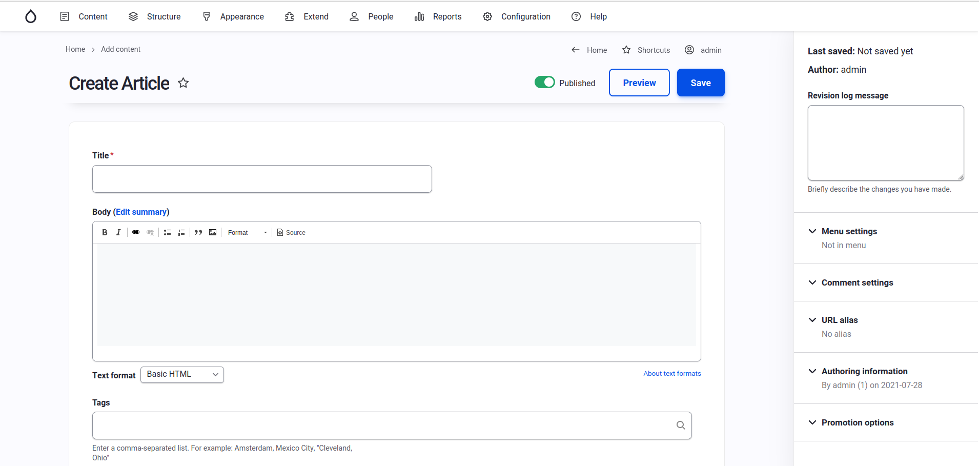
Users often perceive aesthetically pleasing design as design that’s more usable. Here is the same form, but using the Gin Admin Theme.
Here is the same form, but using the Gin Admin Theme.

Install & Configure the Gin Admin Theme
To switch to the Gin admin theme install and enable the following projects:
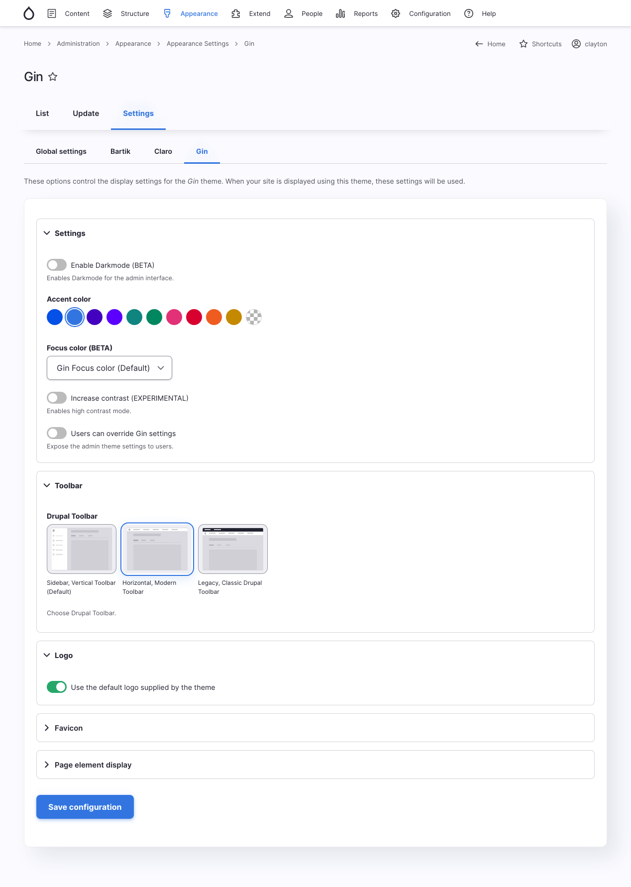
The admin theme comes with several visual styles to choose from, including the ability to set the color palette. Bringing the theme in line with your site’s branding can give it that extra refinement that leaves authors and editors satisfied when working with the site.

How to Support the Claro and Gin Theme Projects
Note that you will want to test the editing workflow to ensure there aren’t any visual issues. The more that the site’s administrative features have been altered and enhanced by contributed and custom modules, the more potential for display issues in Claro and Gin.
Claro’s maintainers and Gin’s maintainer, Sascha Eggenberger, are all responsive, so I encourage you to report any bugs you find. There’s a good chance they will be resolved quickly.
You can contribute financially to Claro by becoming a Drupal Association member. You can donate to Gin through its OpenCollective fund. Contributing helps keep the projects well-maintained.
Part 1: Conclusion
Something as simple as switching the administrative theme can have a big impact on the usability of your website for sighted users, thanks to the law of the aesthetic-usability effect. Next in our series, we’ll look at improving the user interface further by removing unnecessary elements, which is an important step when working with a CMS as powerful and customizable as Drupal is.
Read More: Enhance Your Drupal Website’s Authoring Experience
Open Read More: Enhance Your Drupal Website’s Authoring Experience configuration options

Leave a comment